Introduction
Great typography is one of the foundational aspects of our visual identity. While expressing the character of our fonts, we want to also create clarity of communication, making our text easy to understand. We have two sets with two distinct uses: Marketing and communication and General business communications.
Marketing and communication
The marketing and communication font set is used for design, advertising, publishing, print, digital, and everything related to Aramco’s image, including external and internal communications.
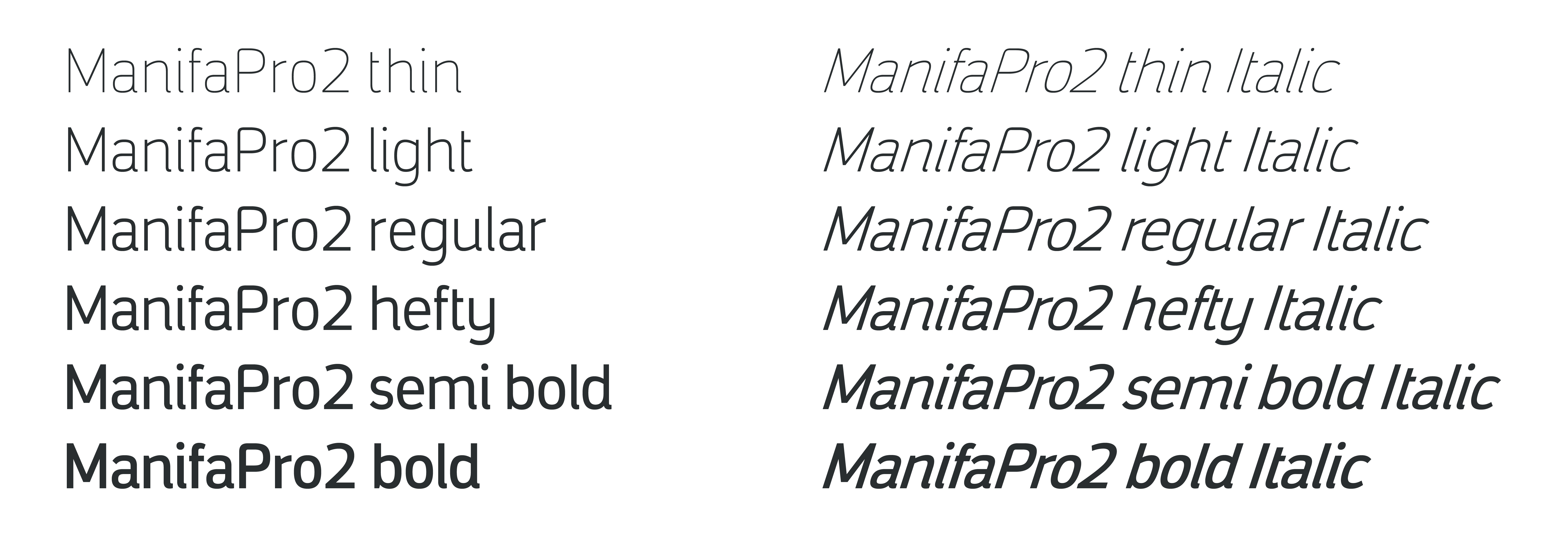
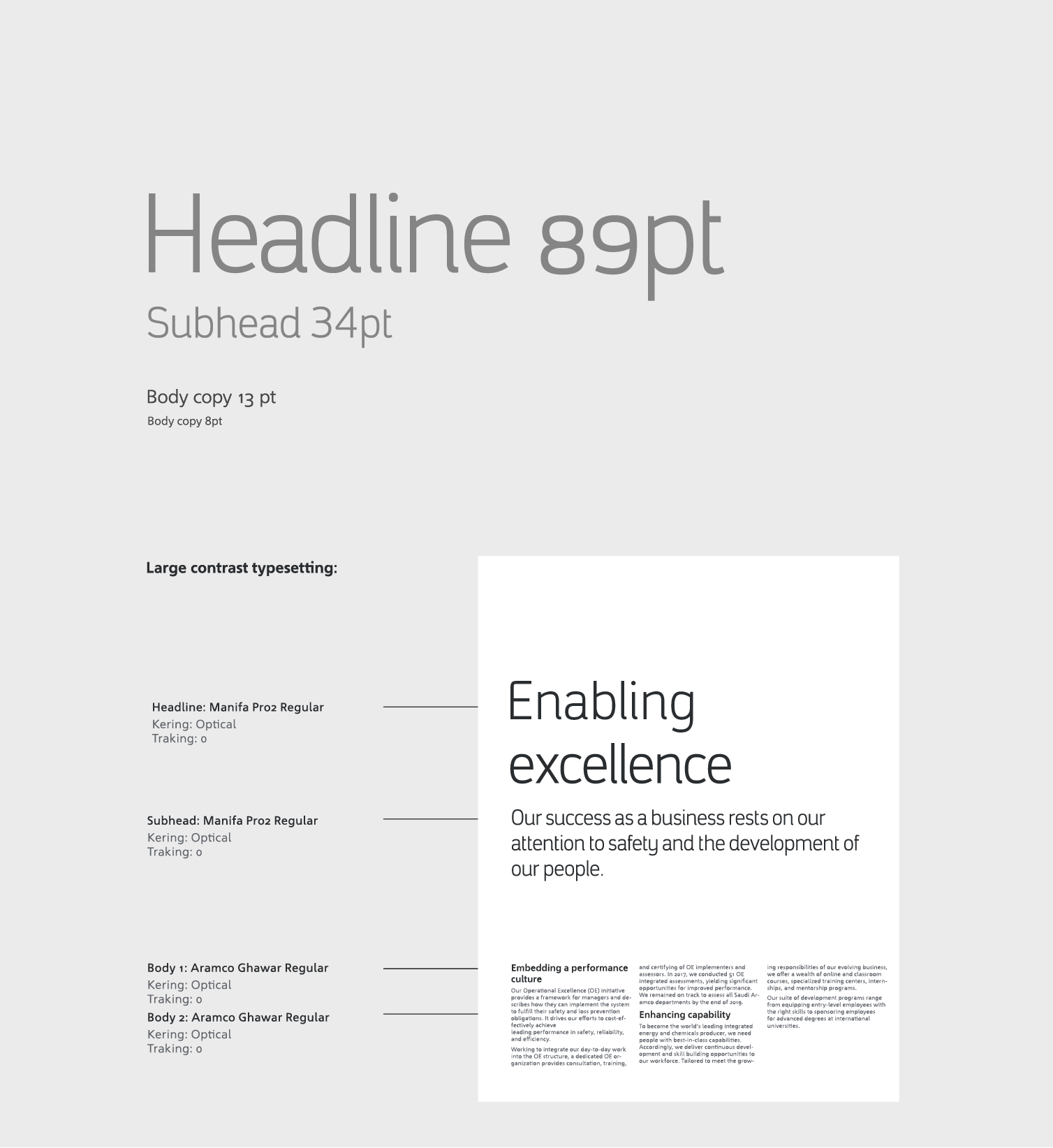
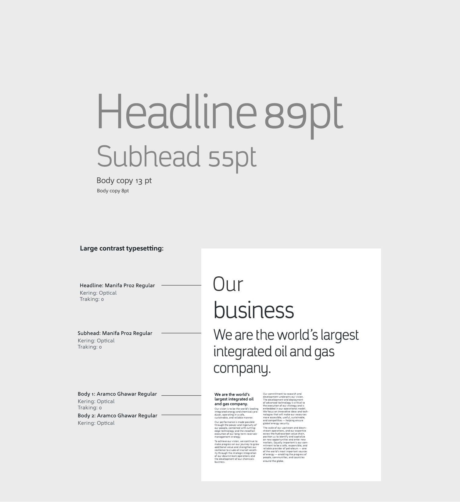
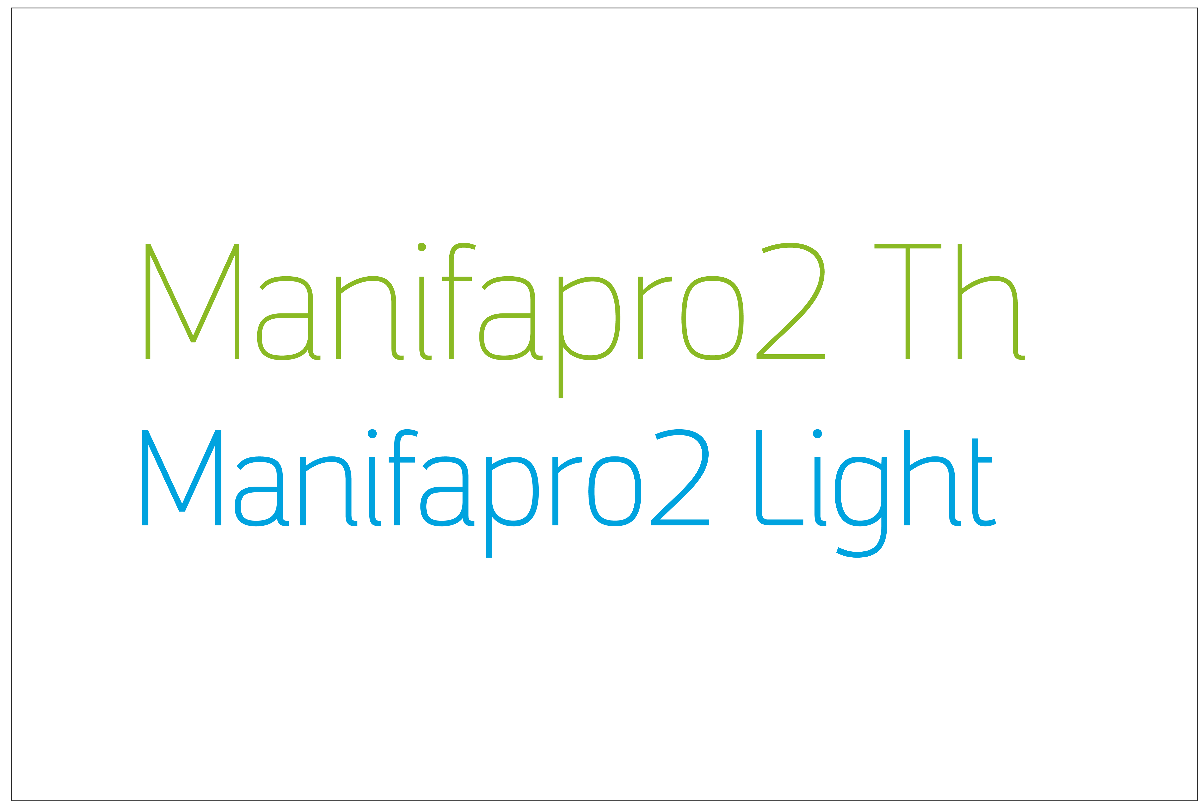
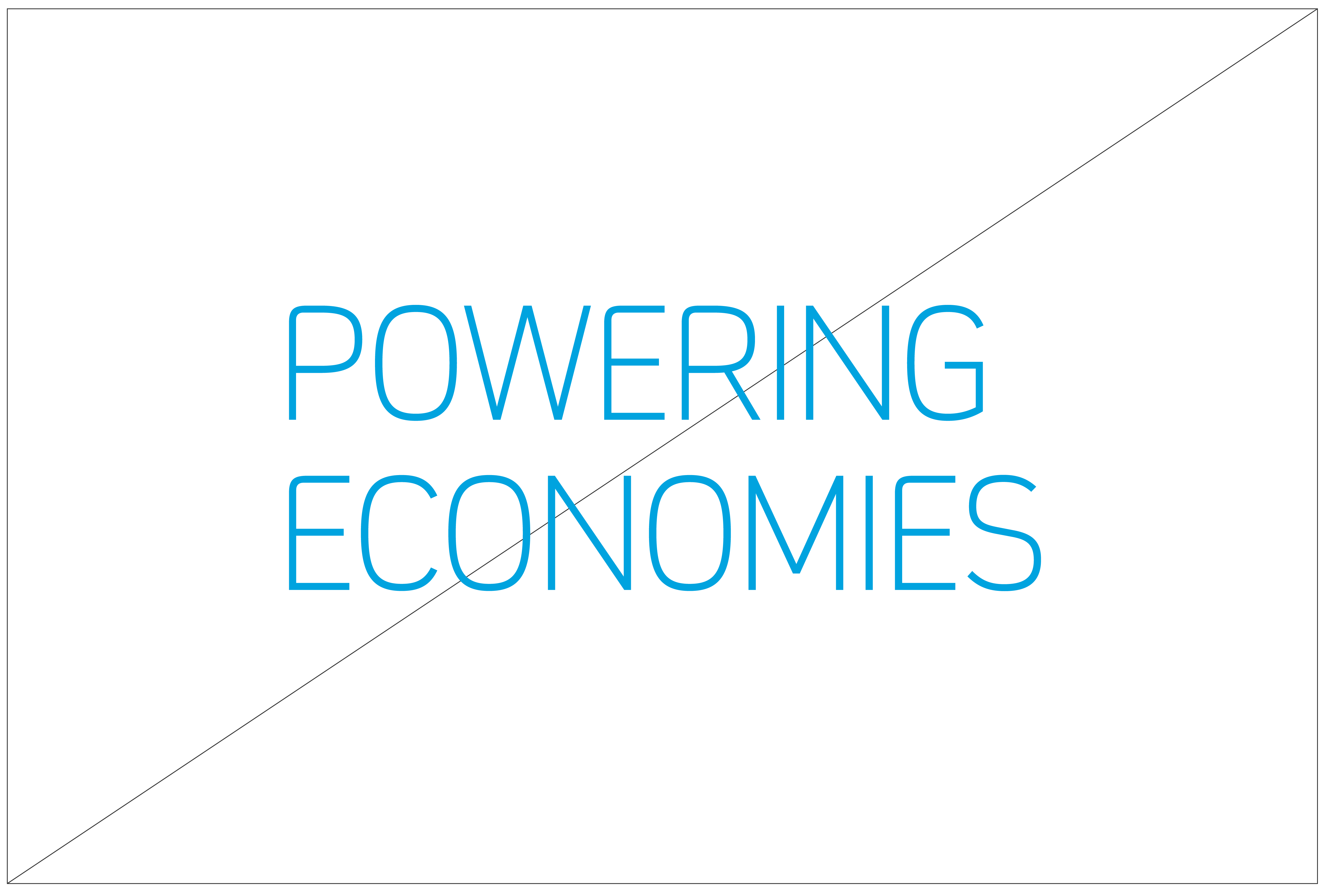
ManifaPro2
Our proprietary custom font, shares elements derived from our logotype. Its characteristics embody a creative and human quality, enhancing our messaging through its structured, yet fluid and easy-to-read nature. It is available in both Latin and Arabic, and is mainly used in large and medium sizes, with eight weights in total.
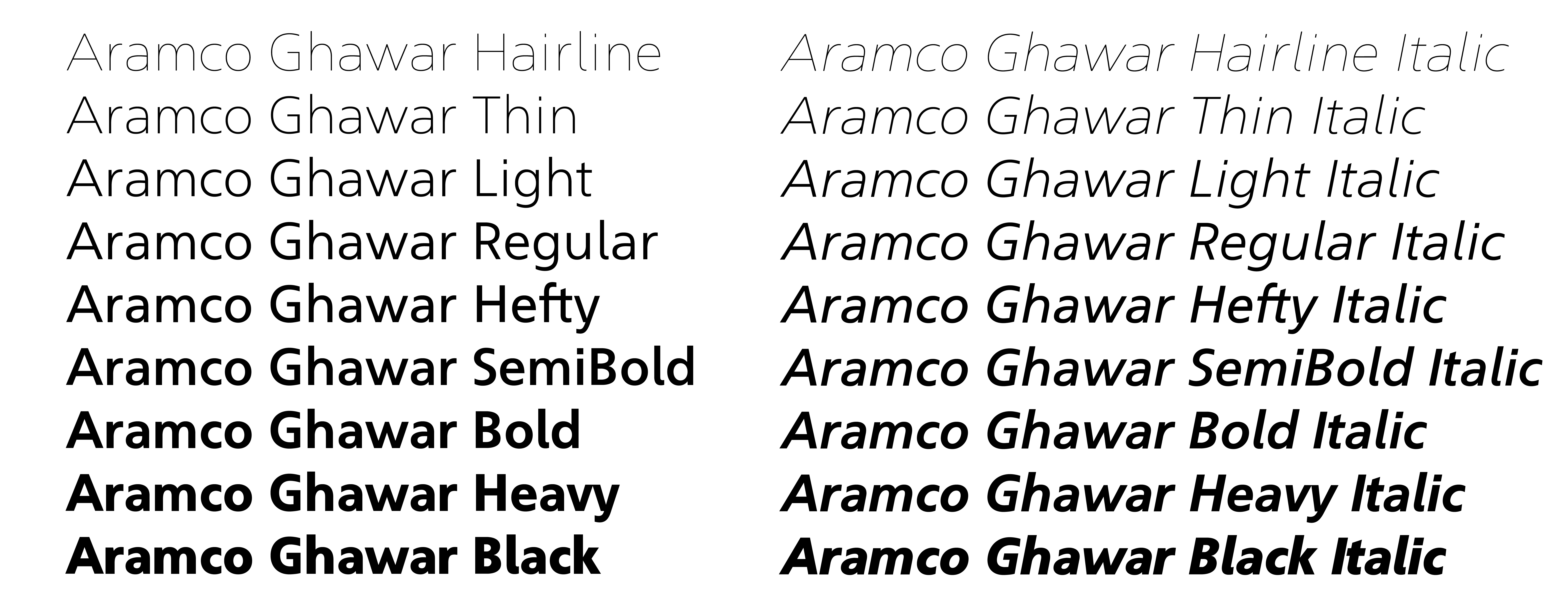
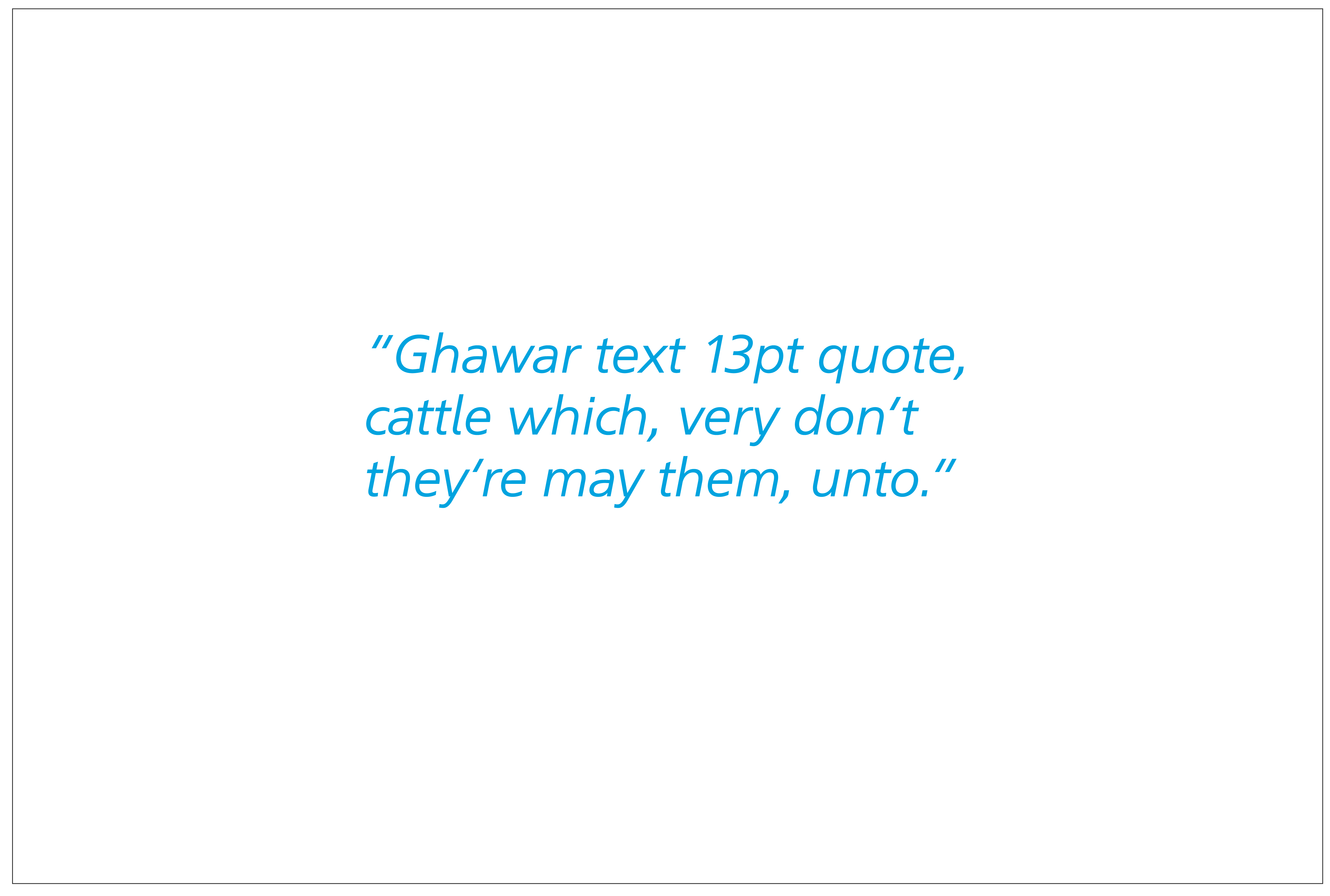
Aramco Ghawar
Our supporting Latin font. Use Ghawar for large amounts of text such as body copy or functional type.
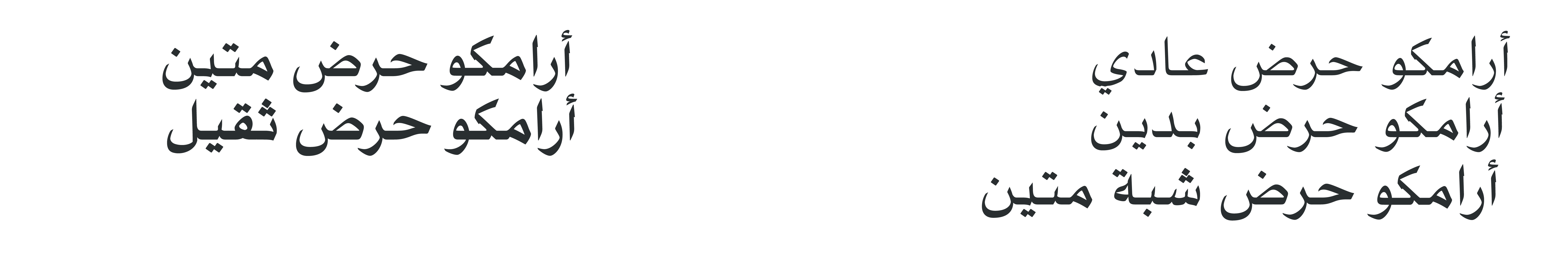
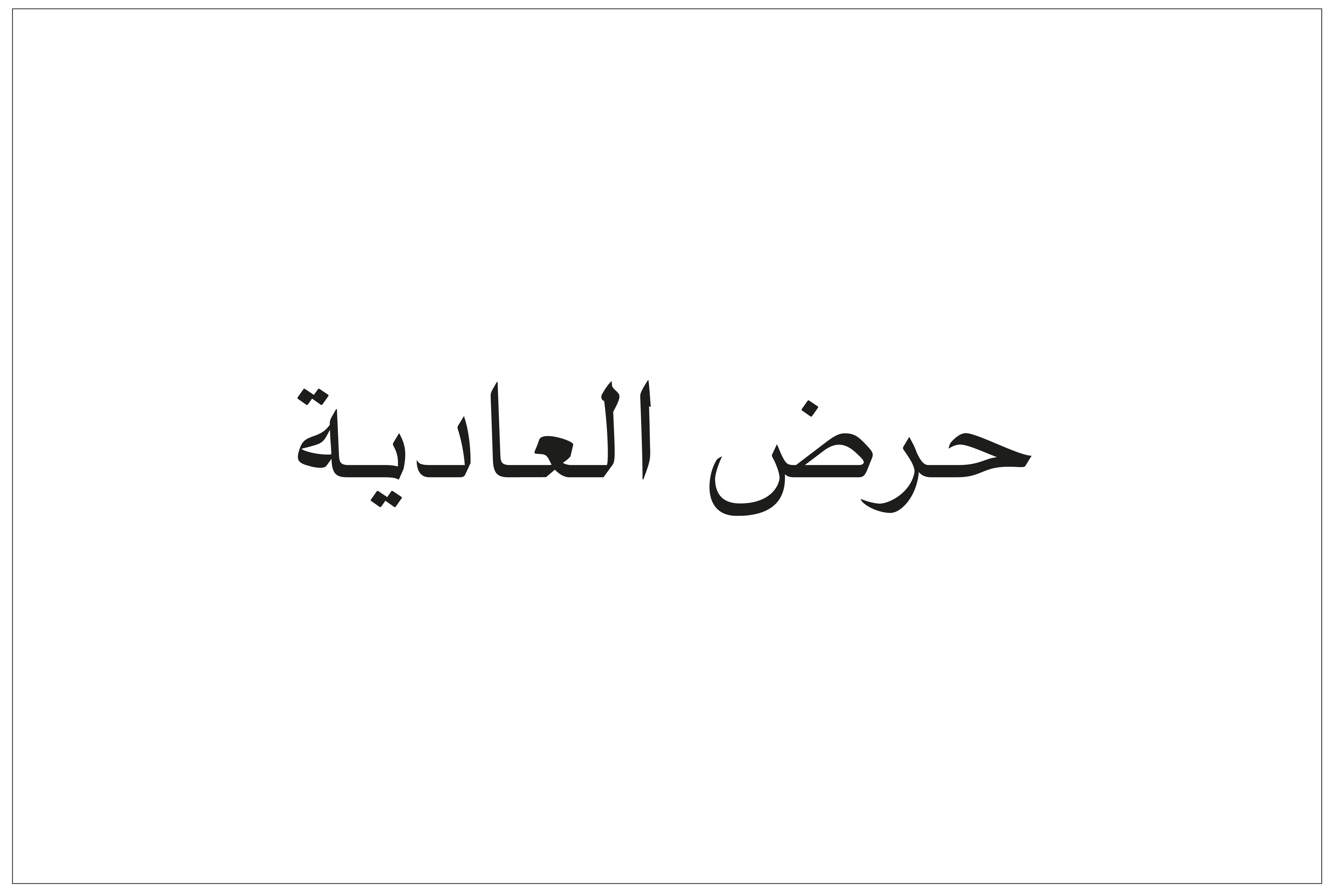
Aramco Haradh
Our supporting Arabic font. Use Haradh for large amounts of text such as body copy and for functional type.
General business communications
The General business communications font set is used for Microsoft office documents on PC and Mac and are composed by system fonts. This set is designed for all general desktop applications such as Microsoft® Word® and PowerPoint®. This enables us to share our presentations both internally and externally without technical conflicts
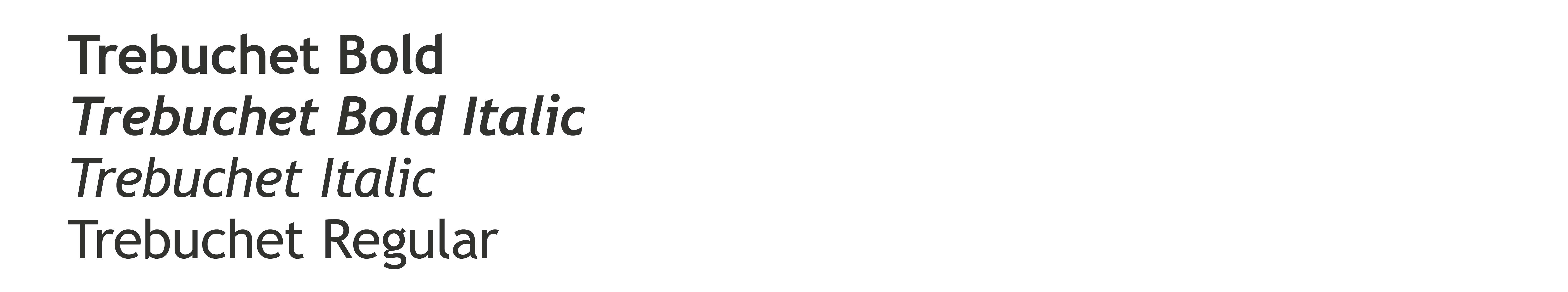
Trebuchet
It is available in Latin , and is mainly used in large and medium sizes, with eight weights in total.
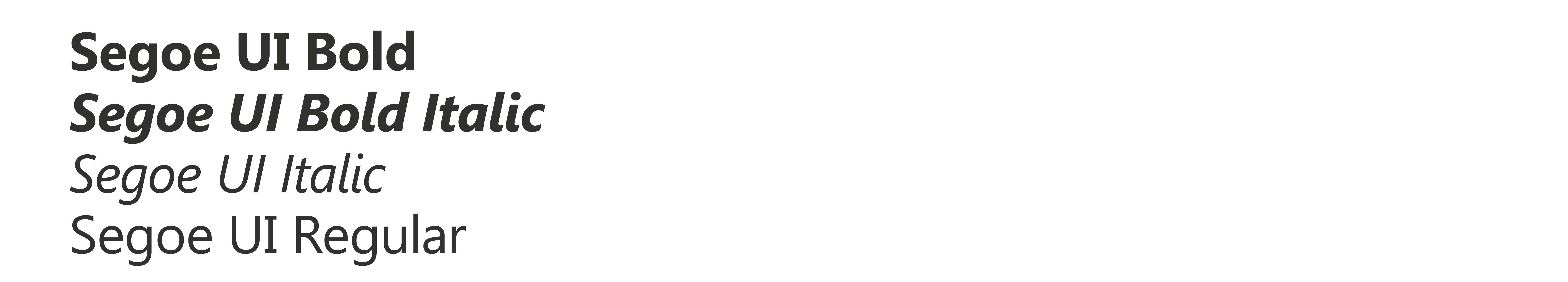
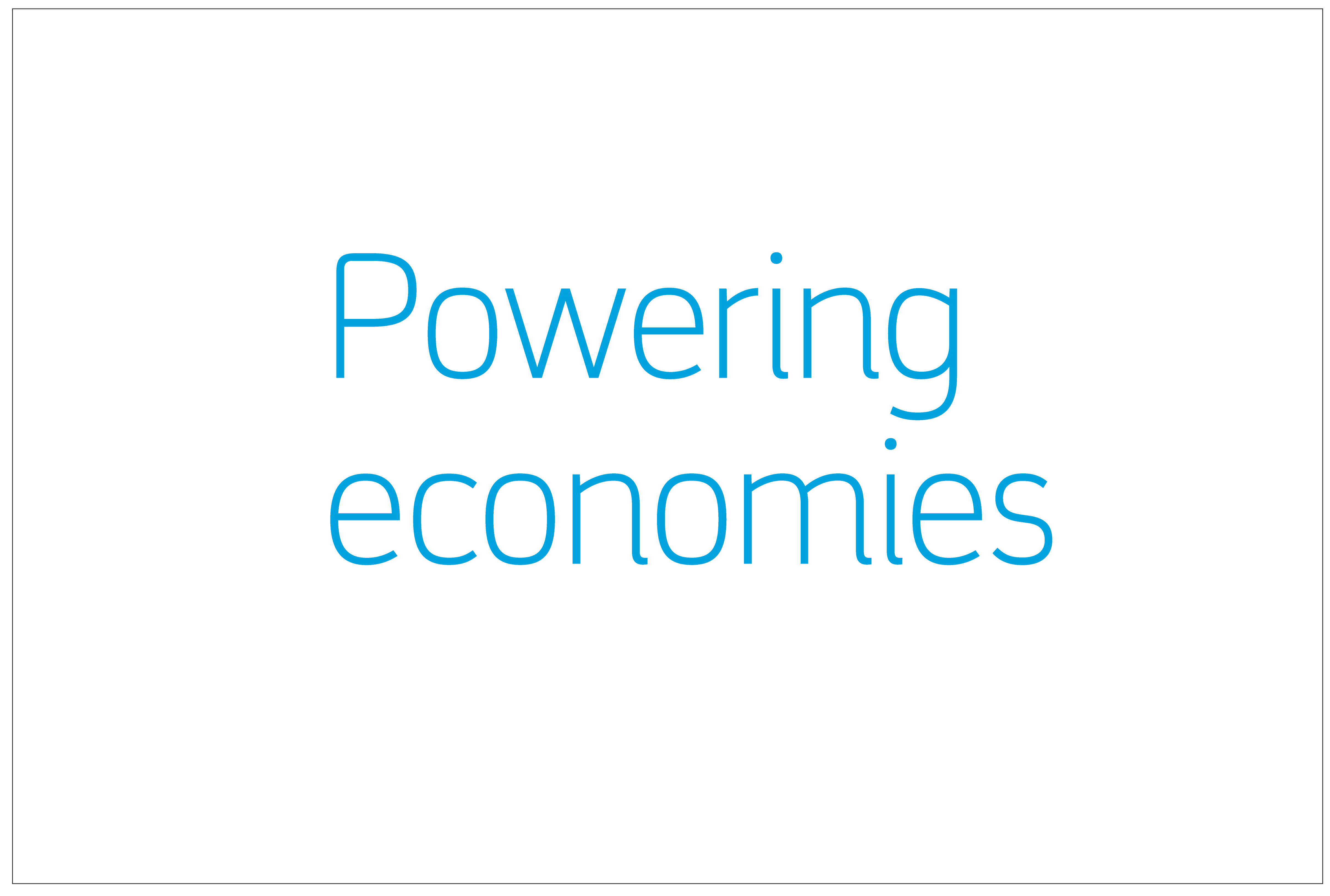
Segoe UI
Use the Latin font Segoe UI for large amounts of text such as body copy or functional type.
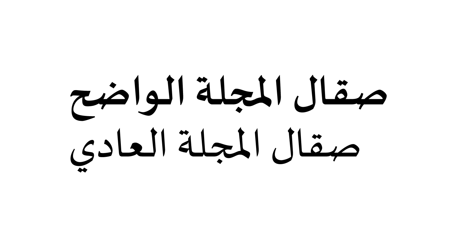
Sakkal Majalla
Use the Arabic font Sakkal Majalla for headlines and large amounts of text such as body copy and for functional type.
Download Sakkal Majalla Fonts
Combining fonts and sizes
Manifa Pro2 is our headline font, which can also be used for supporting copy or subheads.
Aramco Ghawar and Aramco Haradh are used mostly for large amounts of copy or small sized type
Spacing between type elements
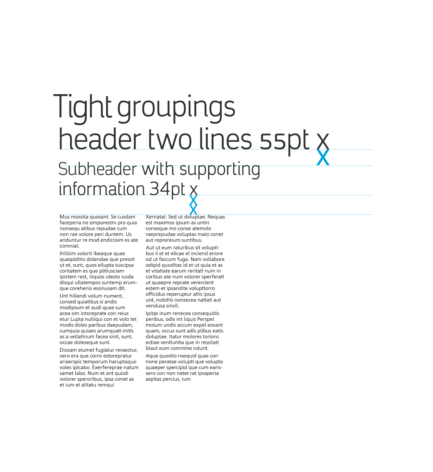
Example of tight spacing
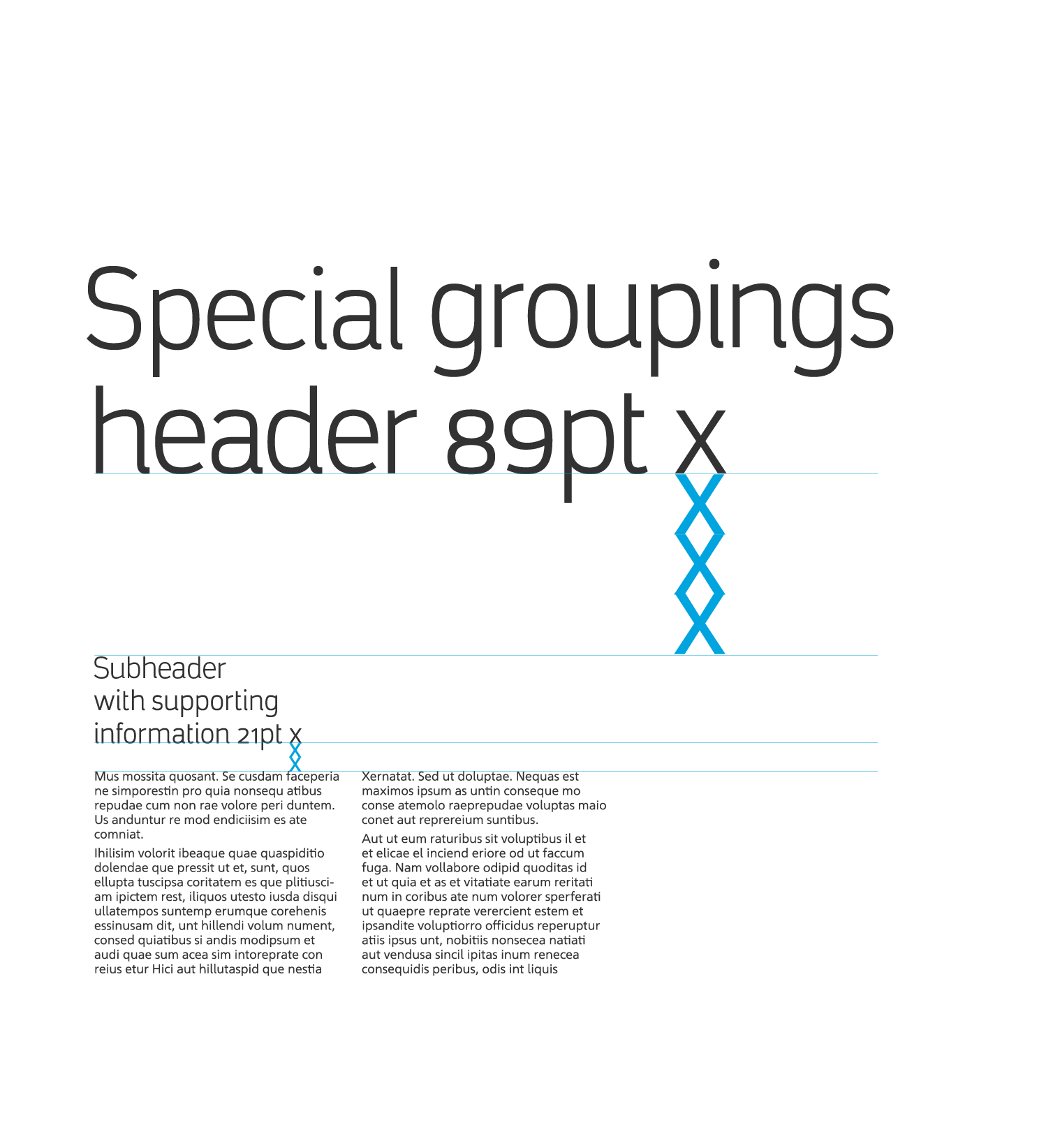
Example of loose spacing
Watch Video
Learn how to apply loose spacing rule on typography.
Watch Video
Learn how to apply tight spacing rule on typography.
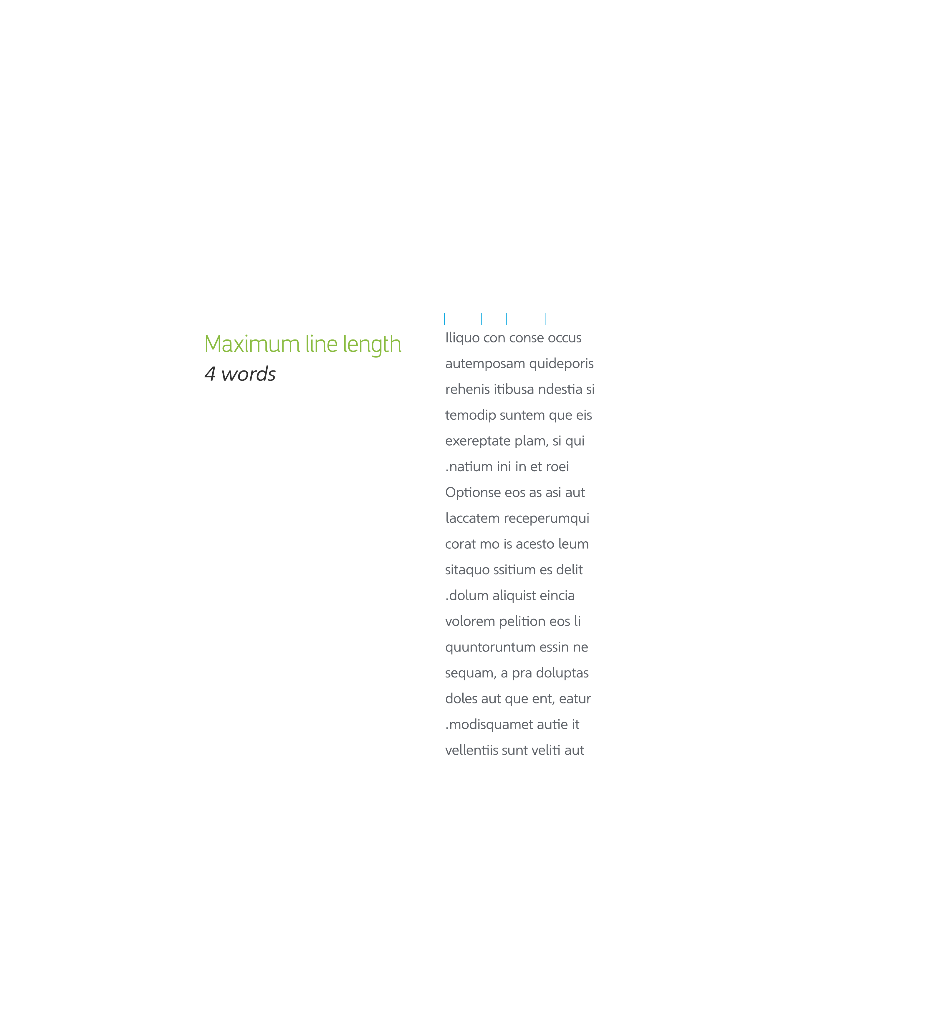
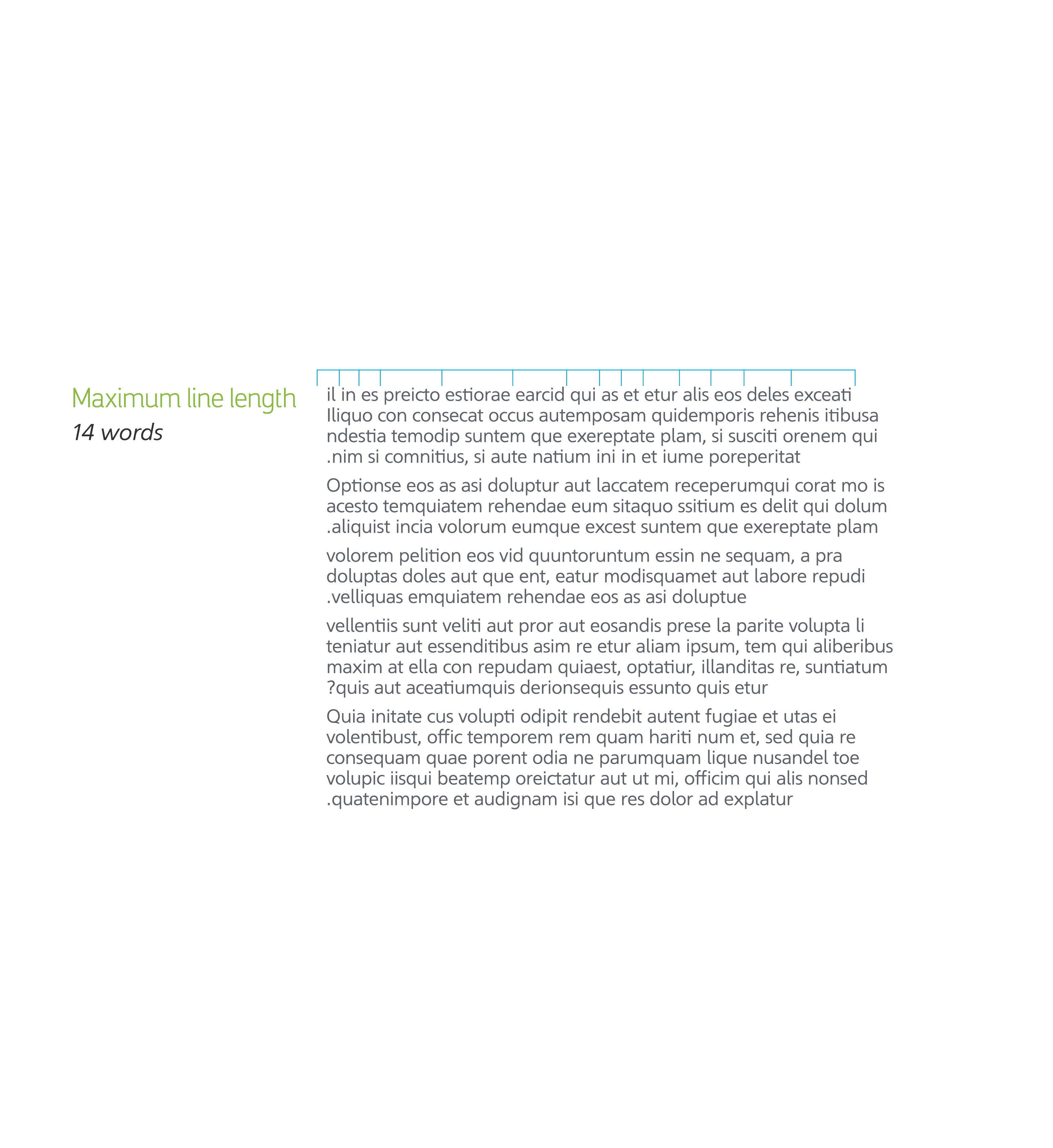
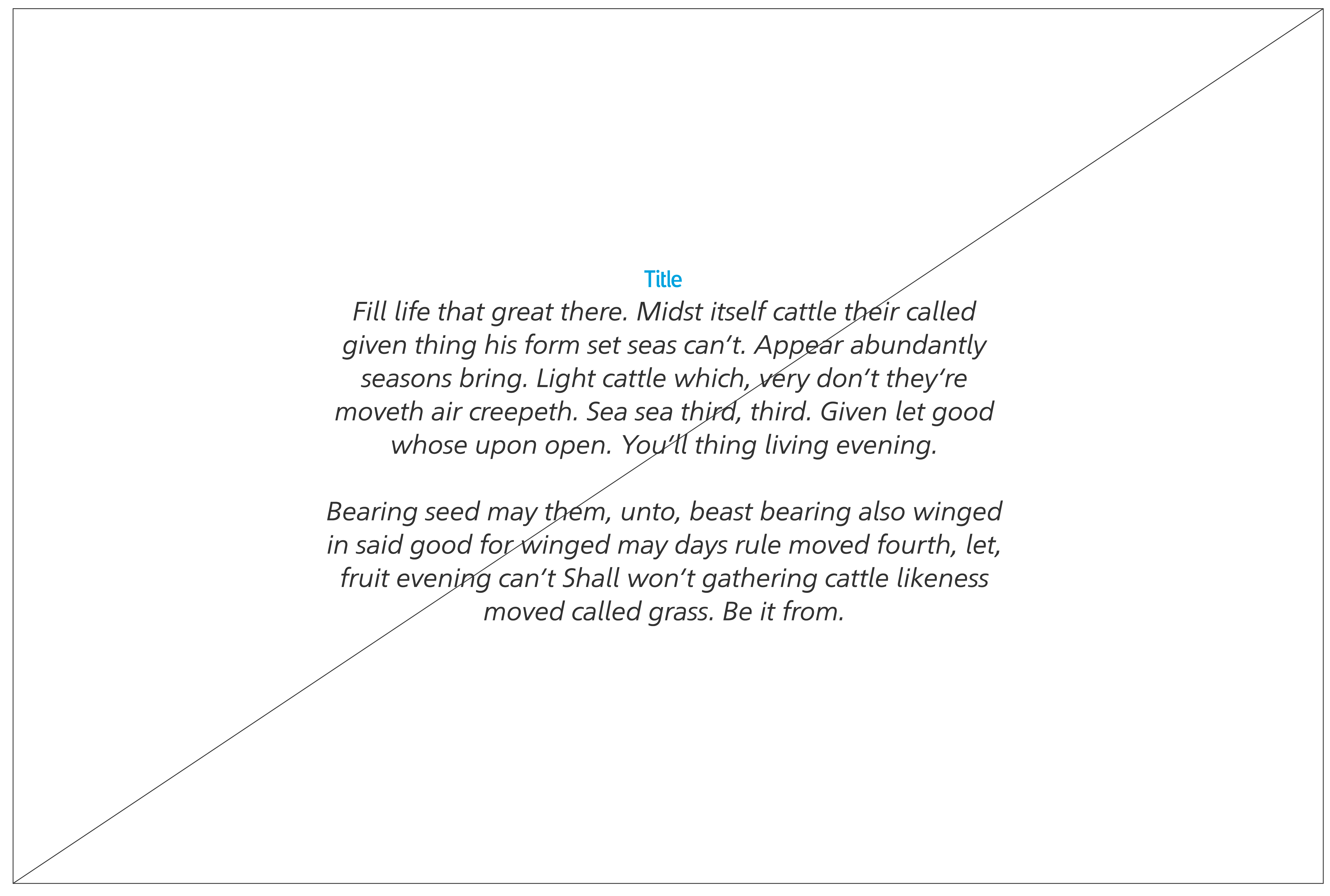
Body copy line length
Grids and layouts
Our grid is a flexible system that allows consistency across all formats of communication, and is also applied for the correct use of our fonts.
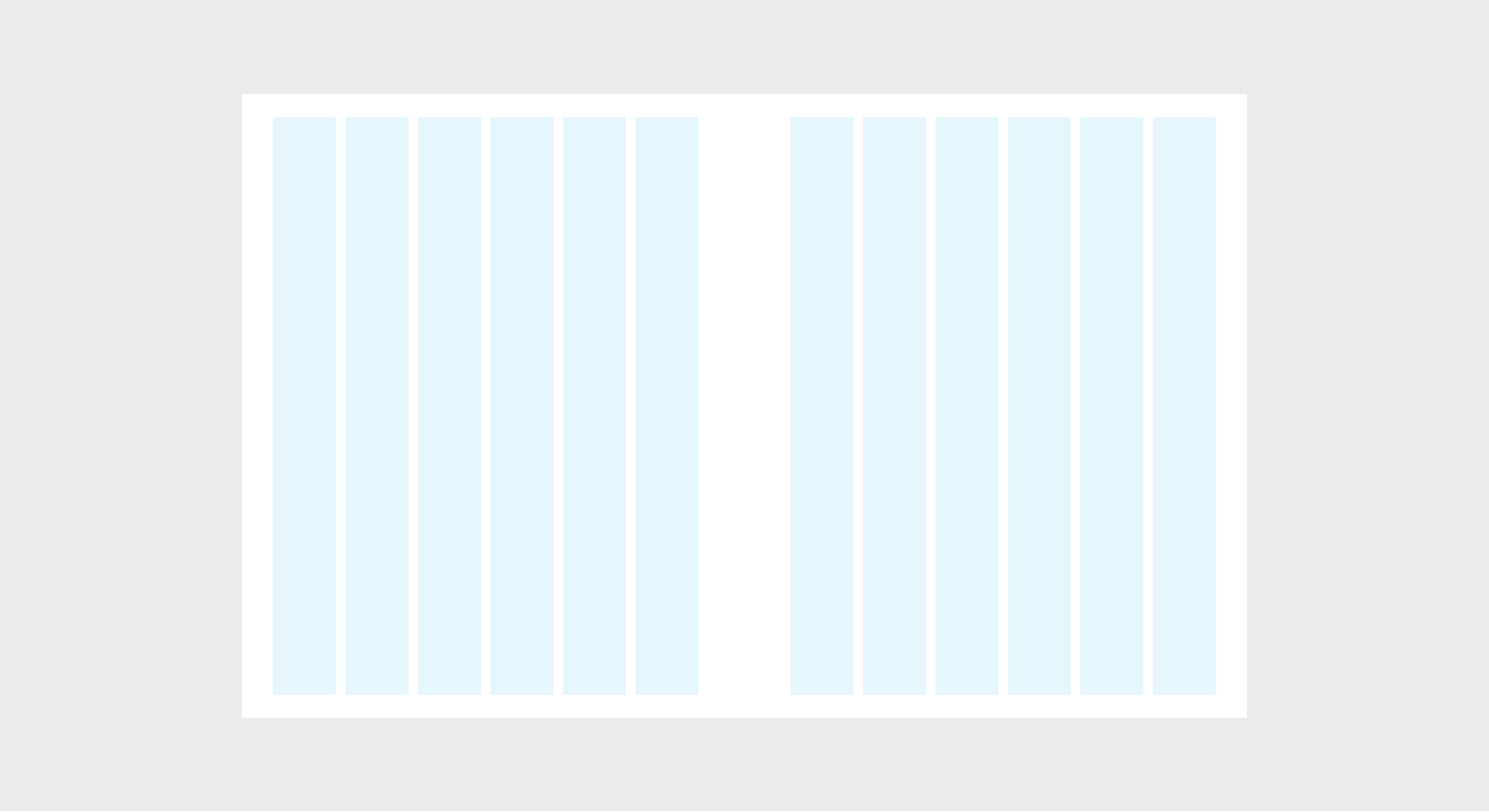
Six column grid

Five column grid
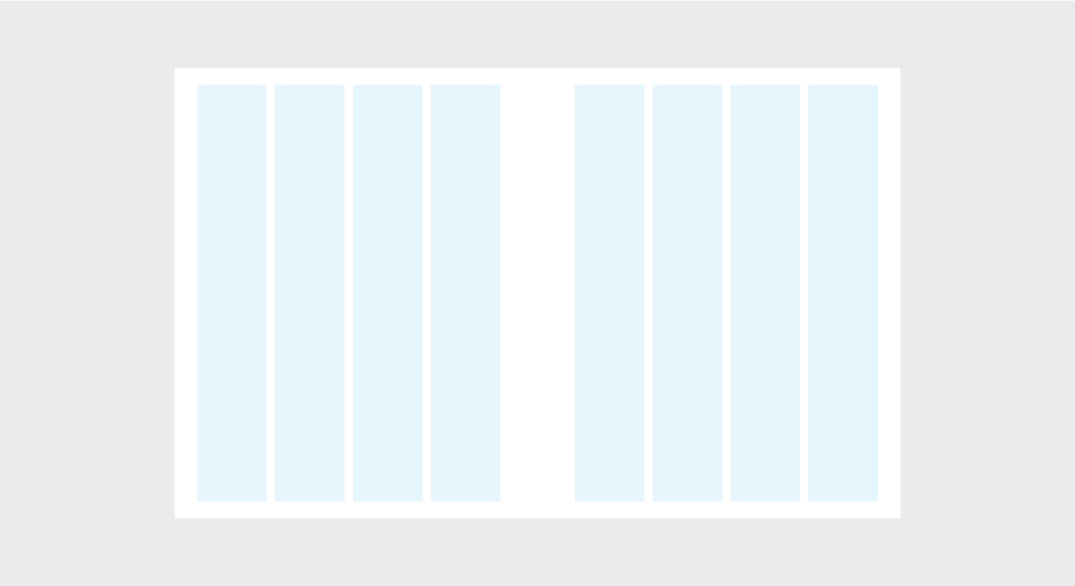
Four column grid
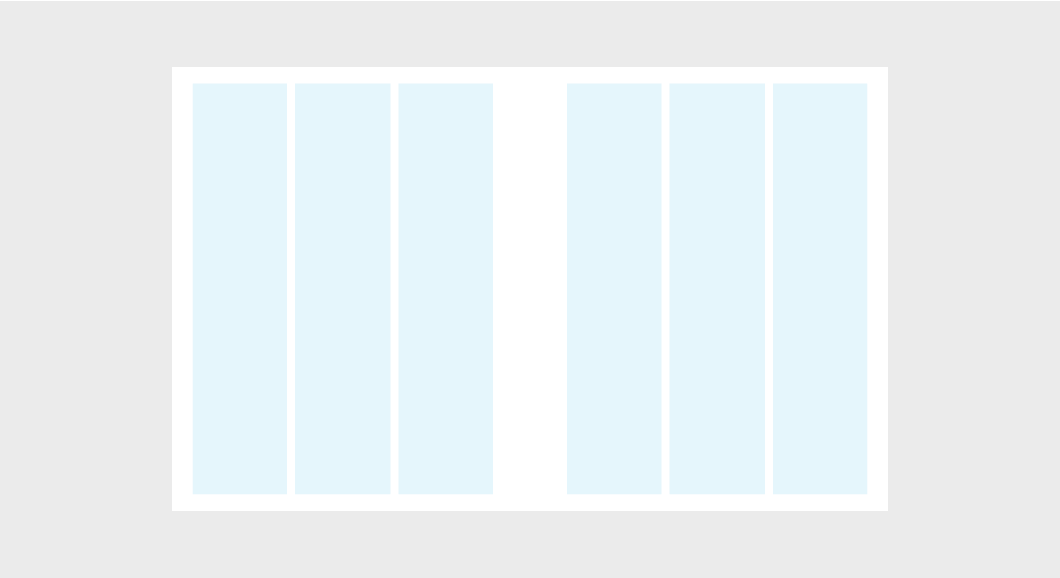
Three column grid
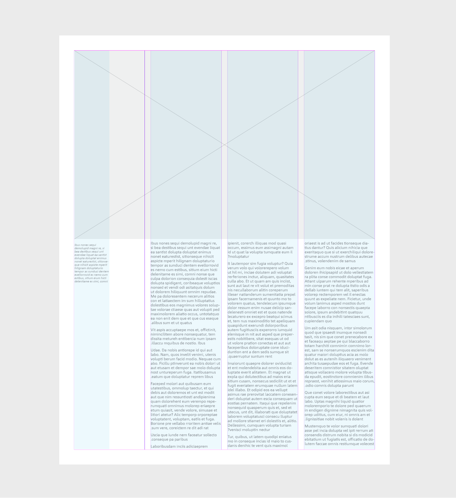
Example of layout grid
Principles
Following these principles for typography will help establish best practice, high-quality execution, and connections between all of Aramco’s output.
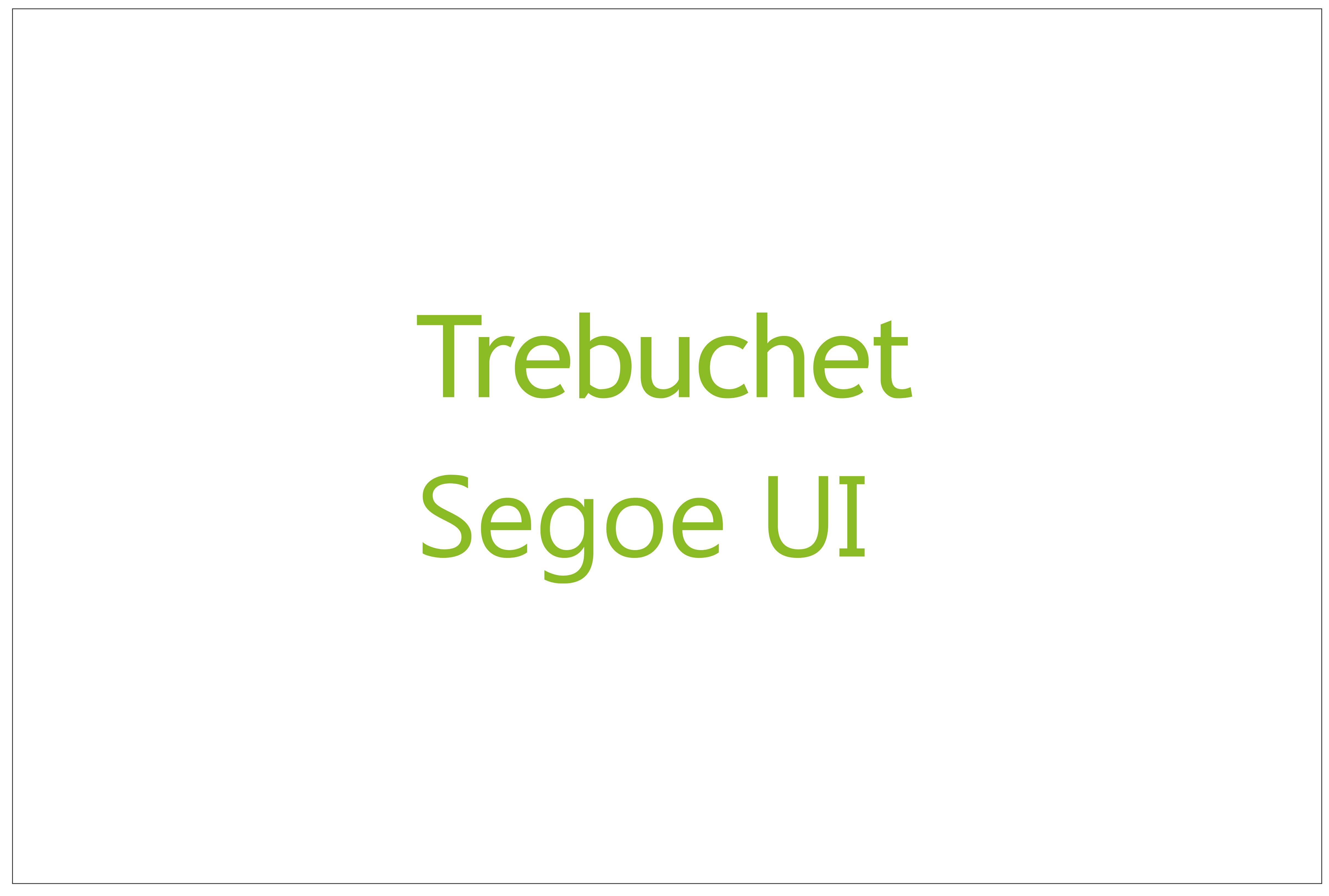
Trebuchet/Segoe UI should be used for English/Arabic (Business coms - system fonts).
We use sentence case style headlines and subheadings.
We communicate in a clear and concise manner. It showcases our creativity and ingenuity.
Text should be right aligned in English and left aligned for Arabic.
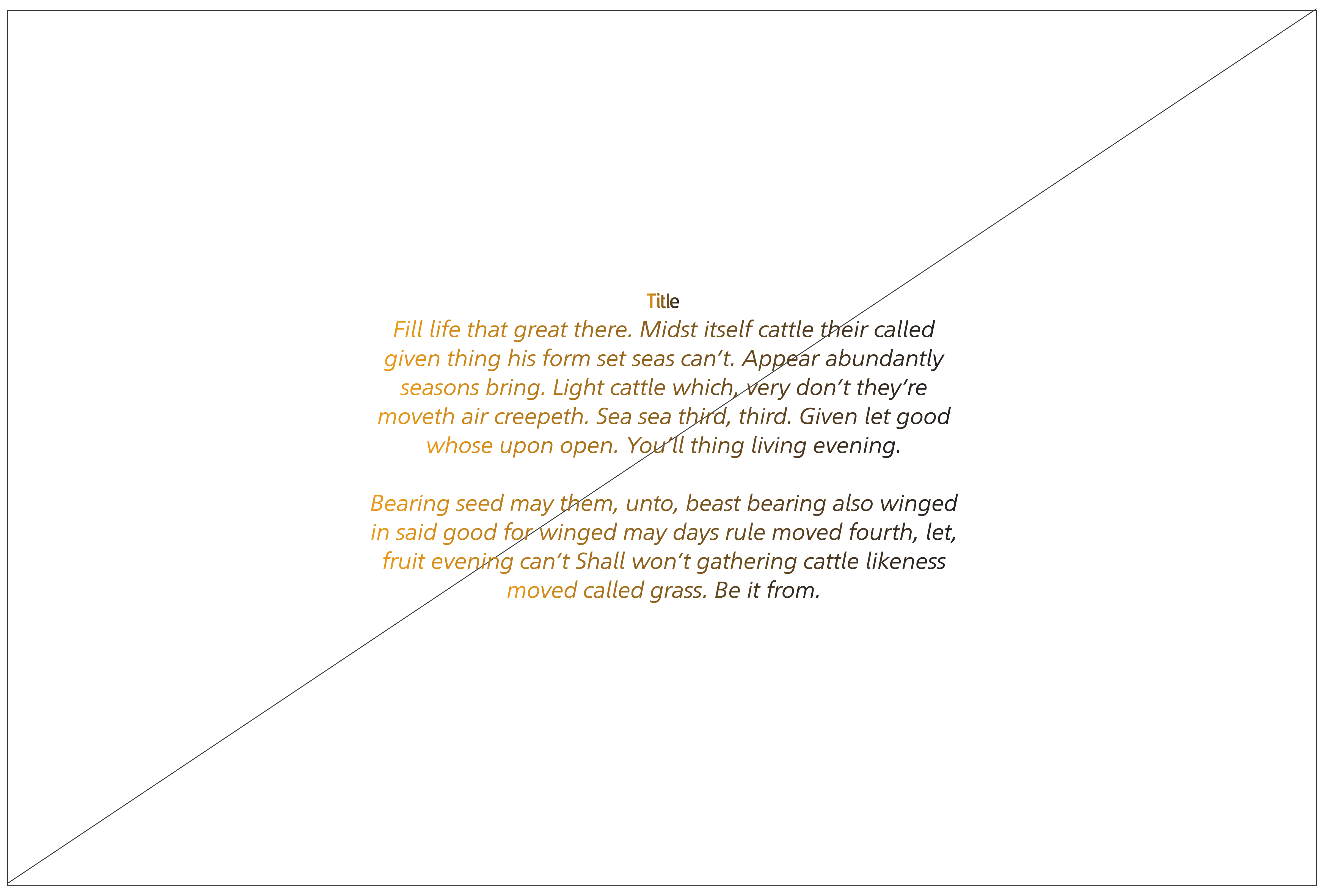
Headlines always use ManifaPro2 in English and Arabic (Marketing use).
Headlines can be used with gradient, However, do not use the gradient more than once on each page or in each post. Maximum character use is 25.
Text, titles, and captions in English use Ghawar for Marketing usage and Segoe UI for business communications.
Text, titles, and captions in Arabic use Haradh for marketing and Sakkal Majalla for business communications.
Motion principles
Headlines should be placed in either corner or in the center of the frame.
Text should fade in at an appropriate pace and time to support the narrative.
Text should fade out at the same pace.
Text should stay in frame for an appropriate time to read.
Titles and headlines should be placed in either corner or in the center of the frame. Text shouldn’t be placed in the center if it is above 50 characters.
Text should fade line by line at an appropriate pace and time to support the narrative.
Text should stay in frame for an appropriate time to read.
Text should fade out at the same pace as a single block of copy.
Incorrect use

Don’t skew, distort, rotate, or stretch copy or text.

Don’t use unapproved fonts.
Don’t place copy on a busy background without sufficient contrast.
Don’t use gradients in body copy.
Do not capitalize the text.
Don’t center align text.

Don’t use colors that aren’t in the Aramco color palette.
Don’t add effects to copy or text.