-
search
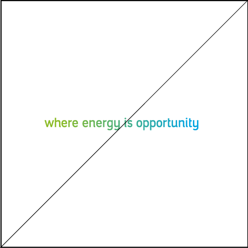
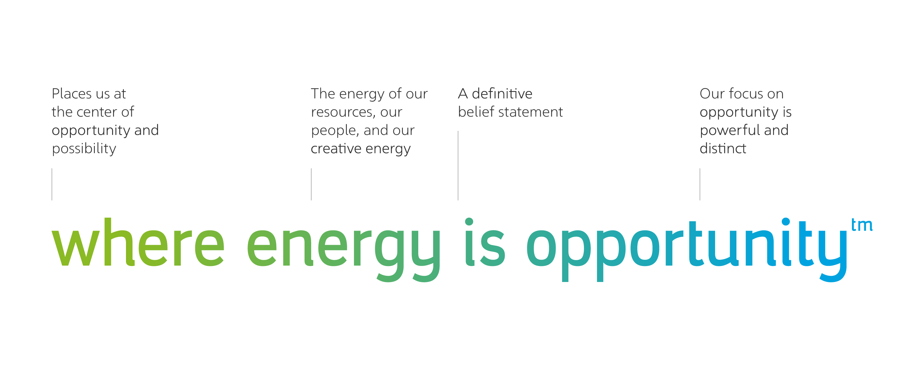
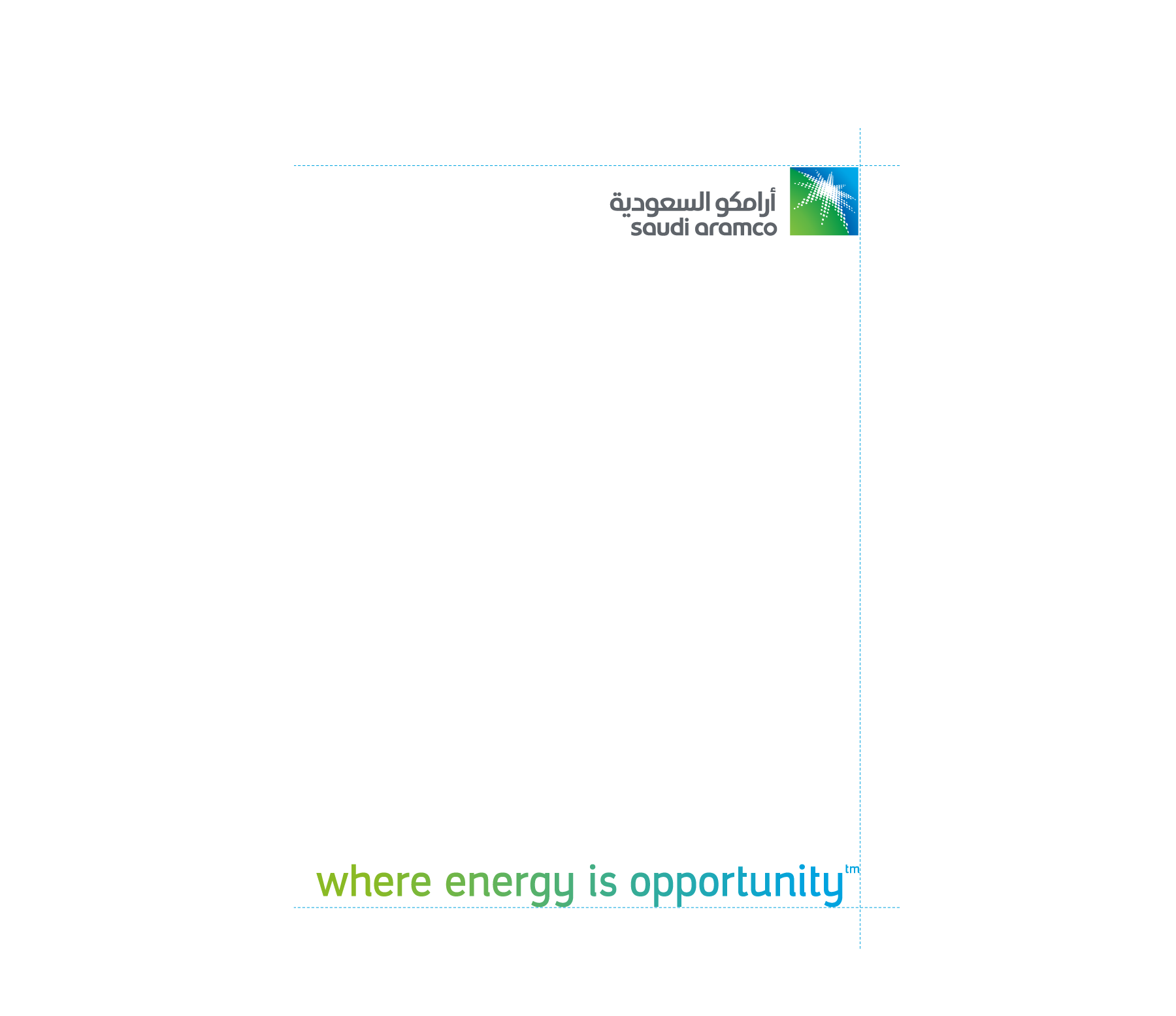
This strong, definitive statement is designed to build an emotional connection with our stakeholders. We are in the opportunity business. Every employee, every initiative, and every facility enables the creation of important new opportunities. The horizontal tagline should be used for most communications and should never be altered. The registered tagline (R) is designed to be used in Kingdom only, while the trademark (tm) is to be used out of Kingdom


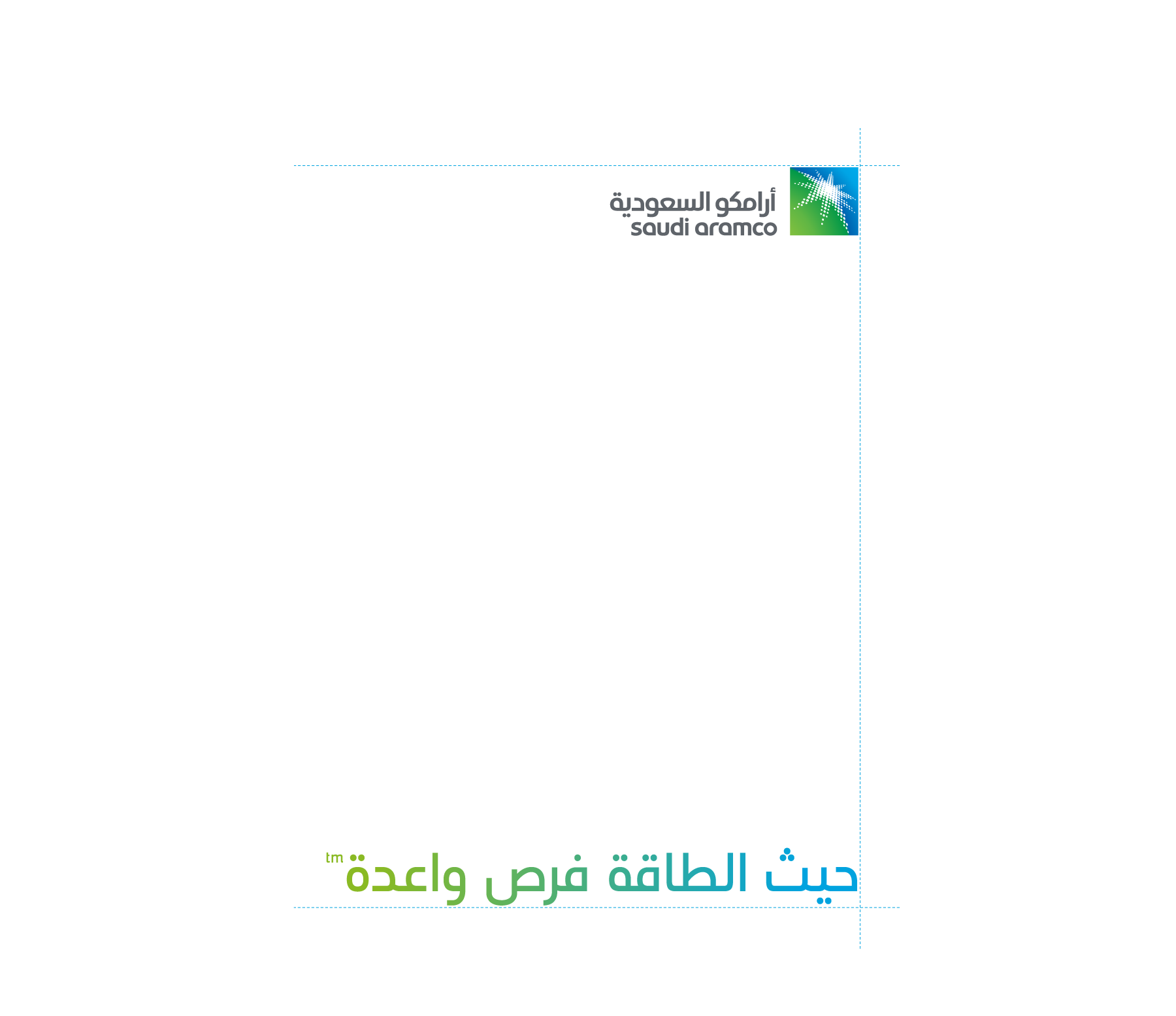
The tagline should always be used with enough space around it so that it is clearly legible and not obscured by other graphic elements.
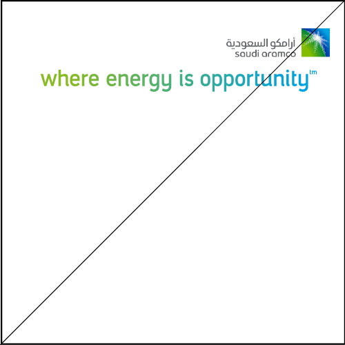
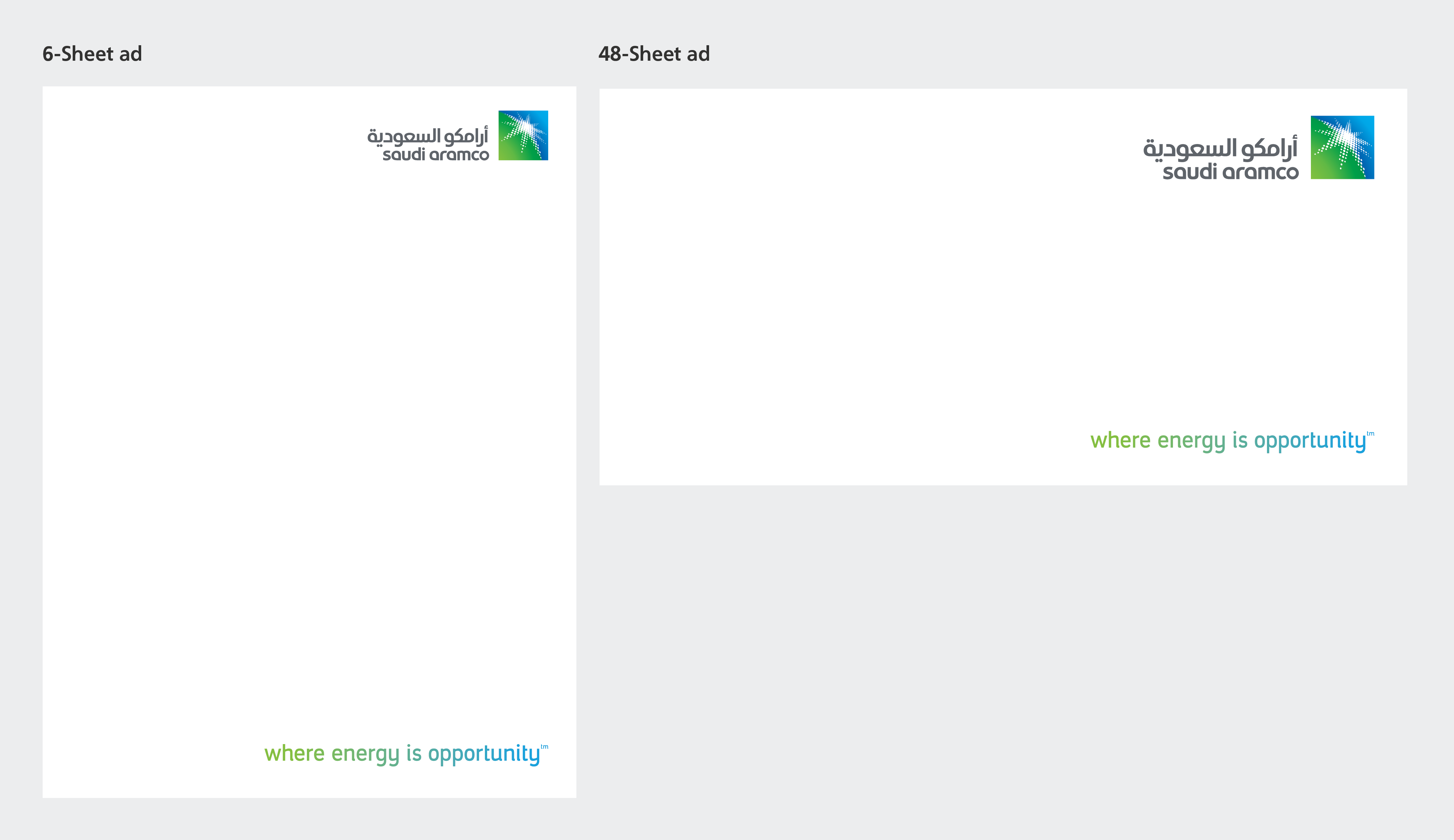
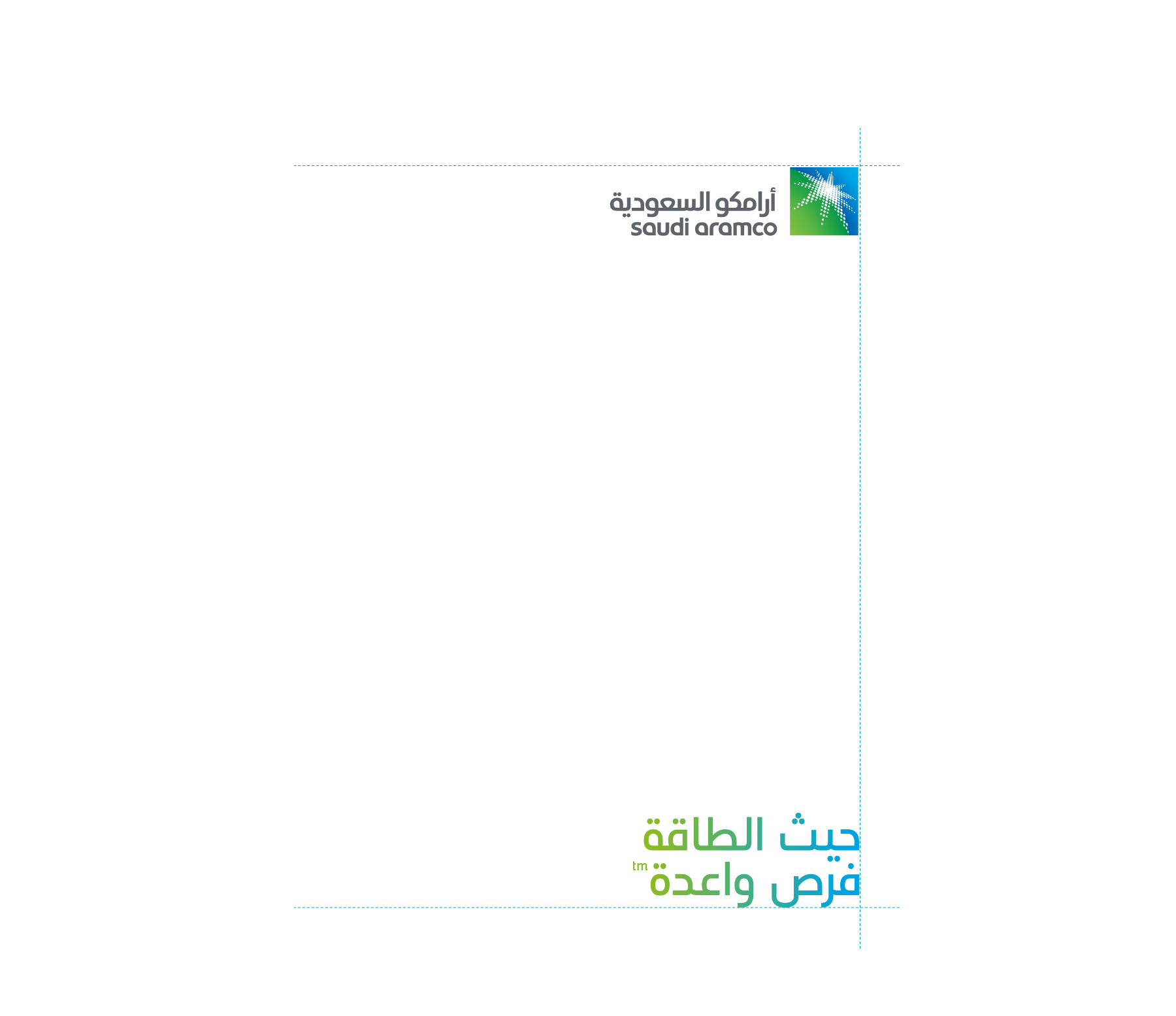
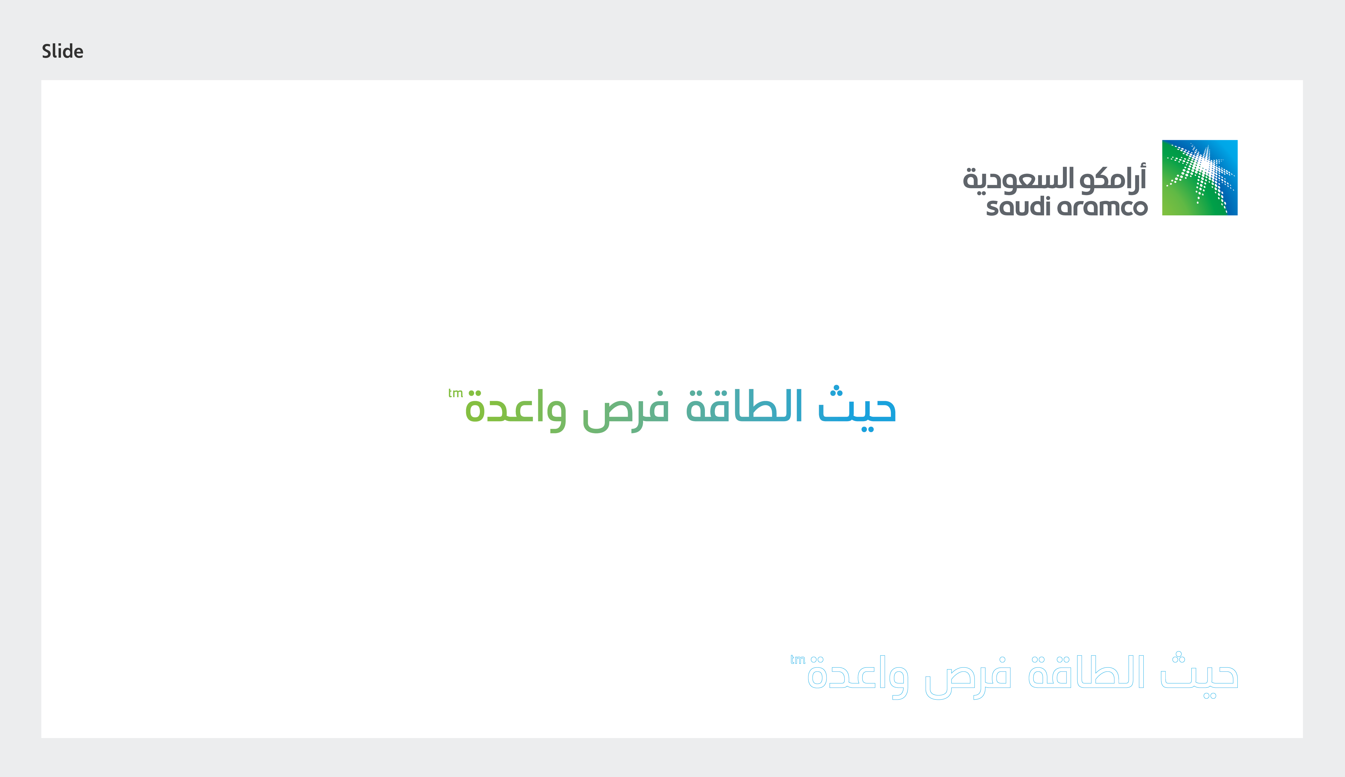
The minimum clear space around the tagline is equal to the logo clear space used on the same page. If the logo appears on the top right, the tagline must be aligned bottom right.
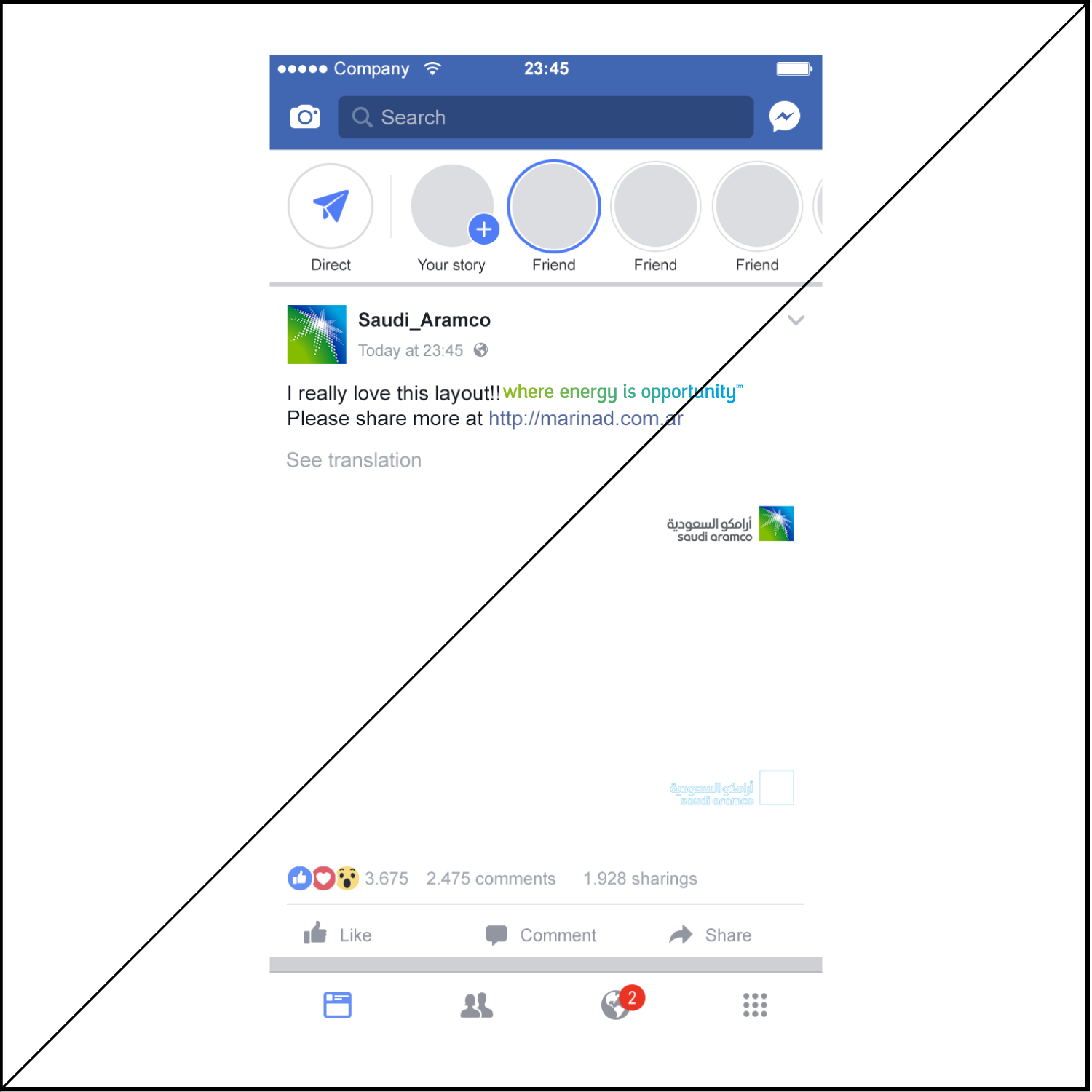
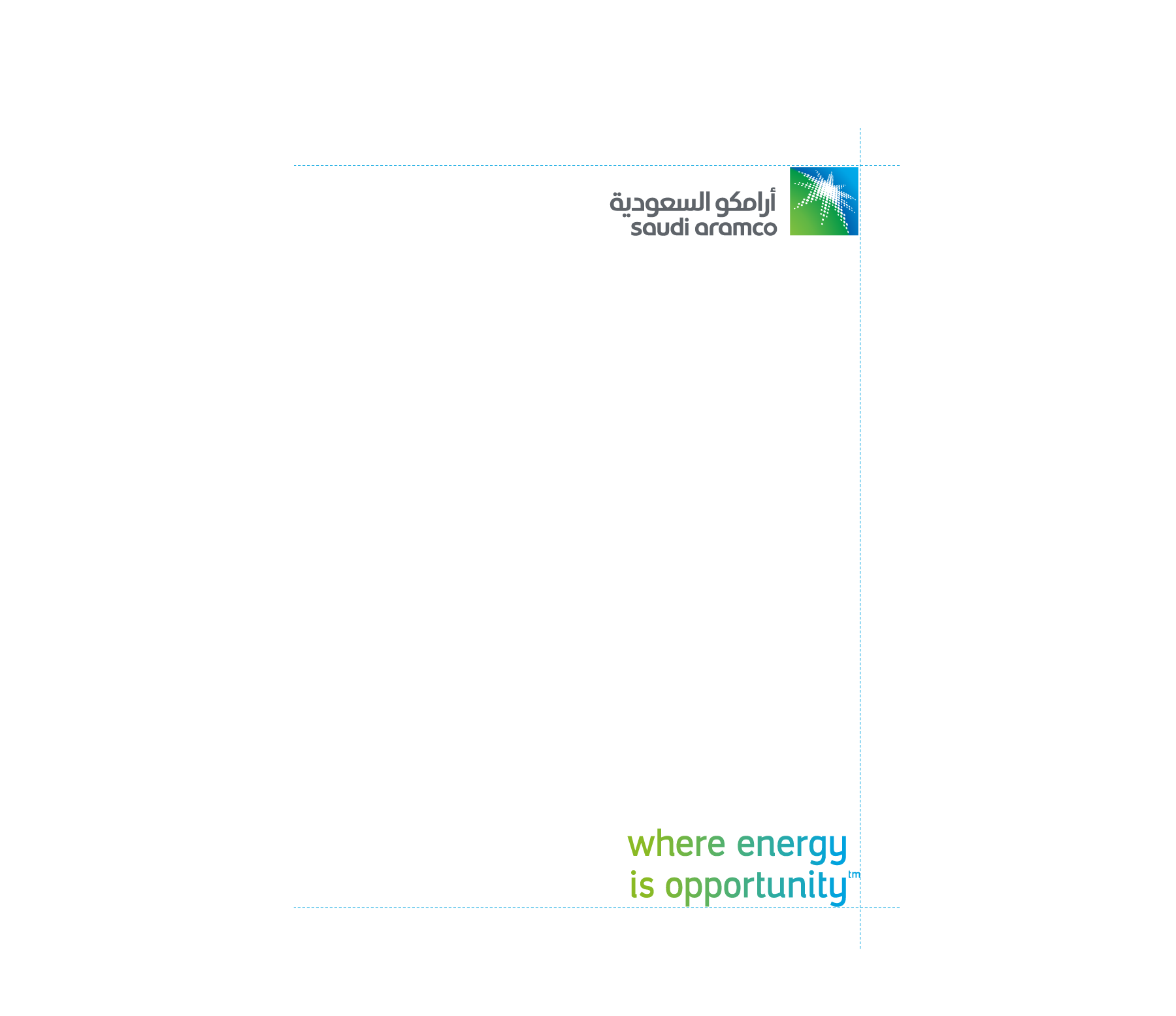
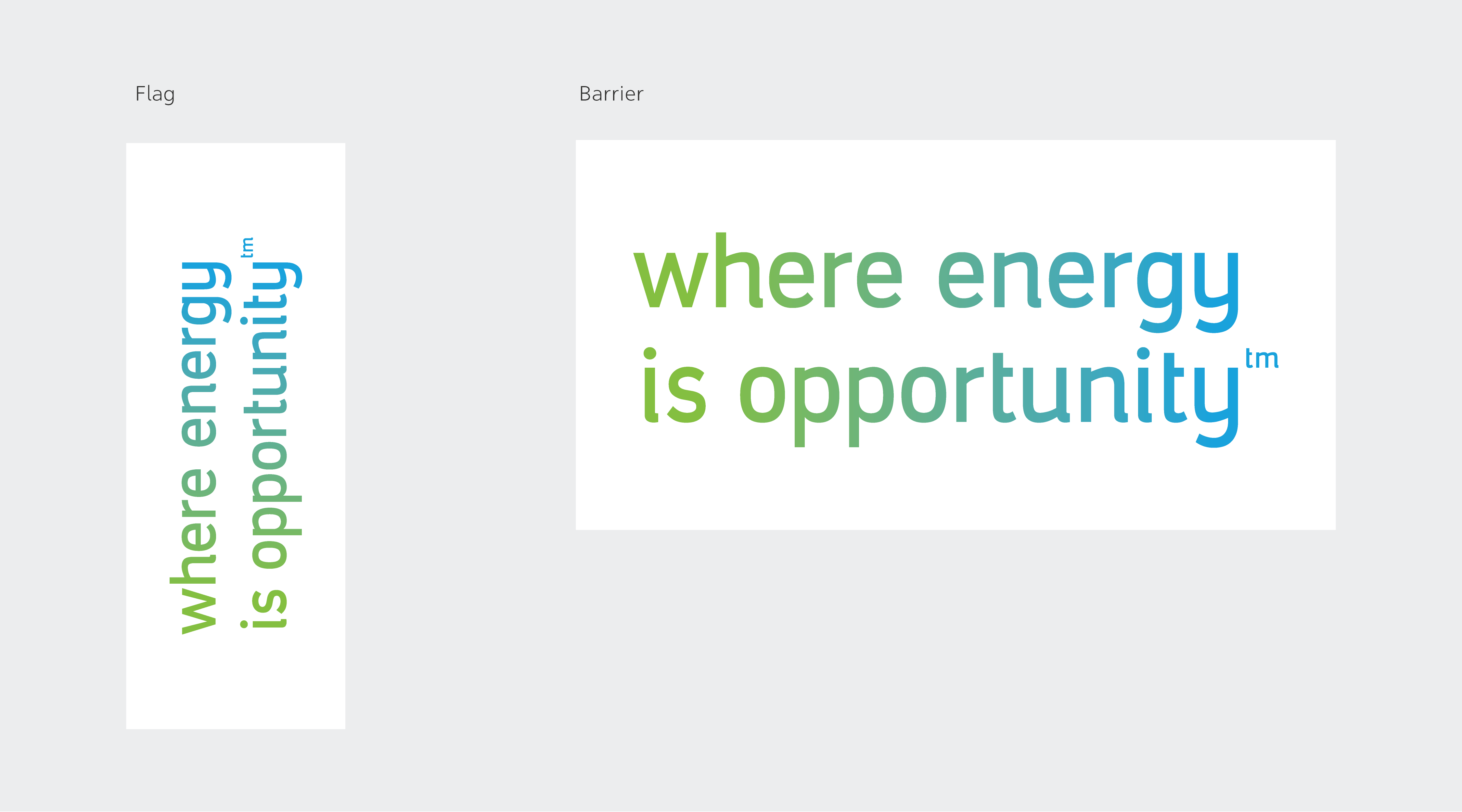
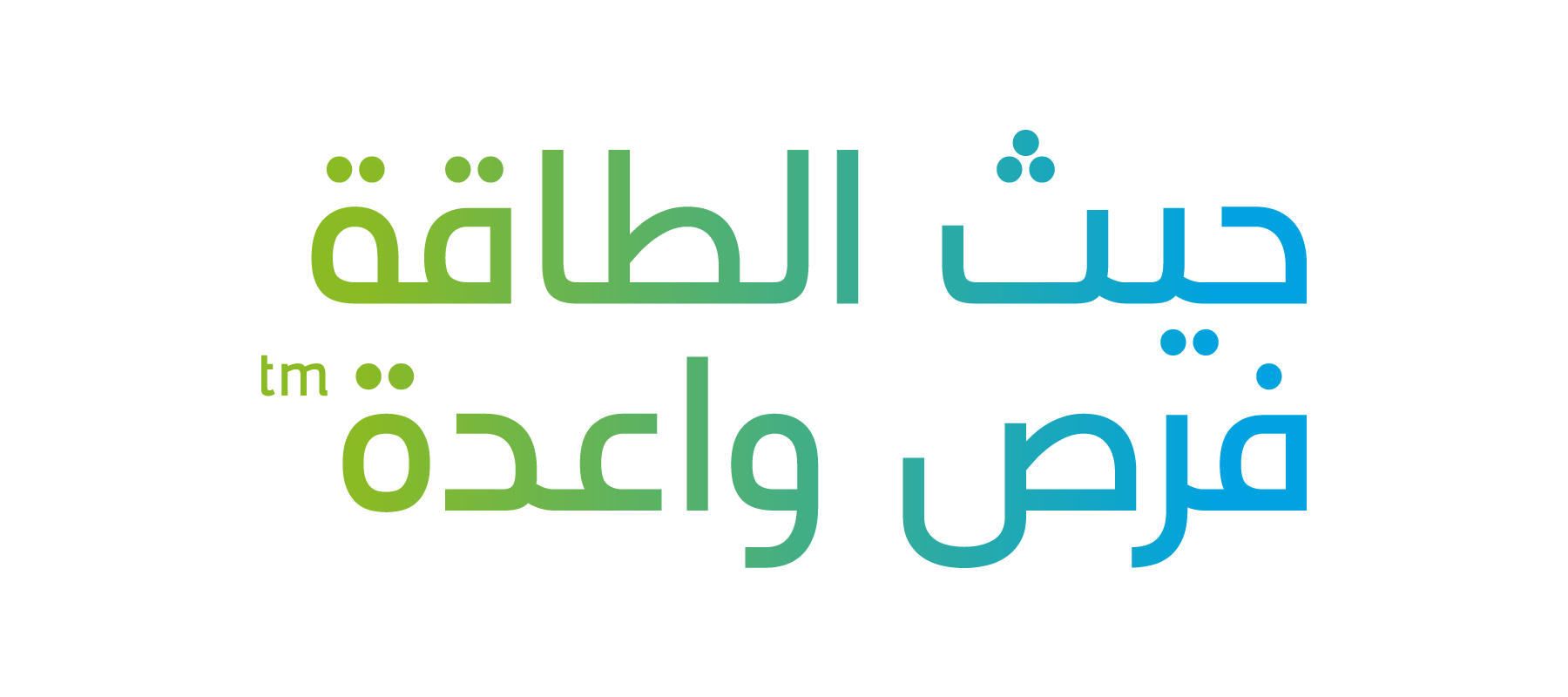
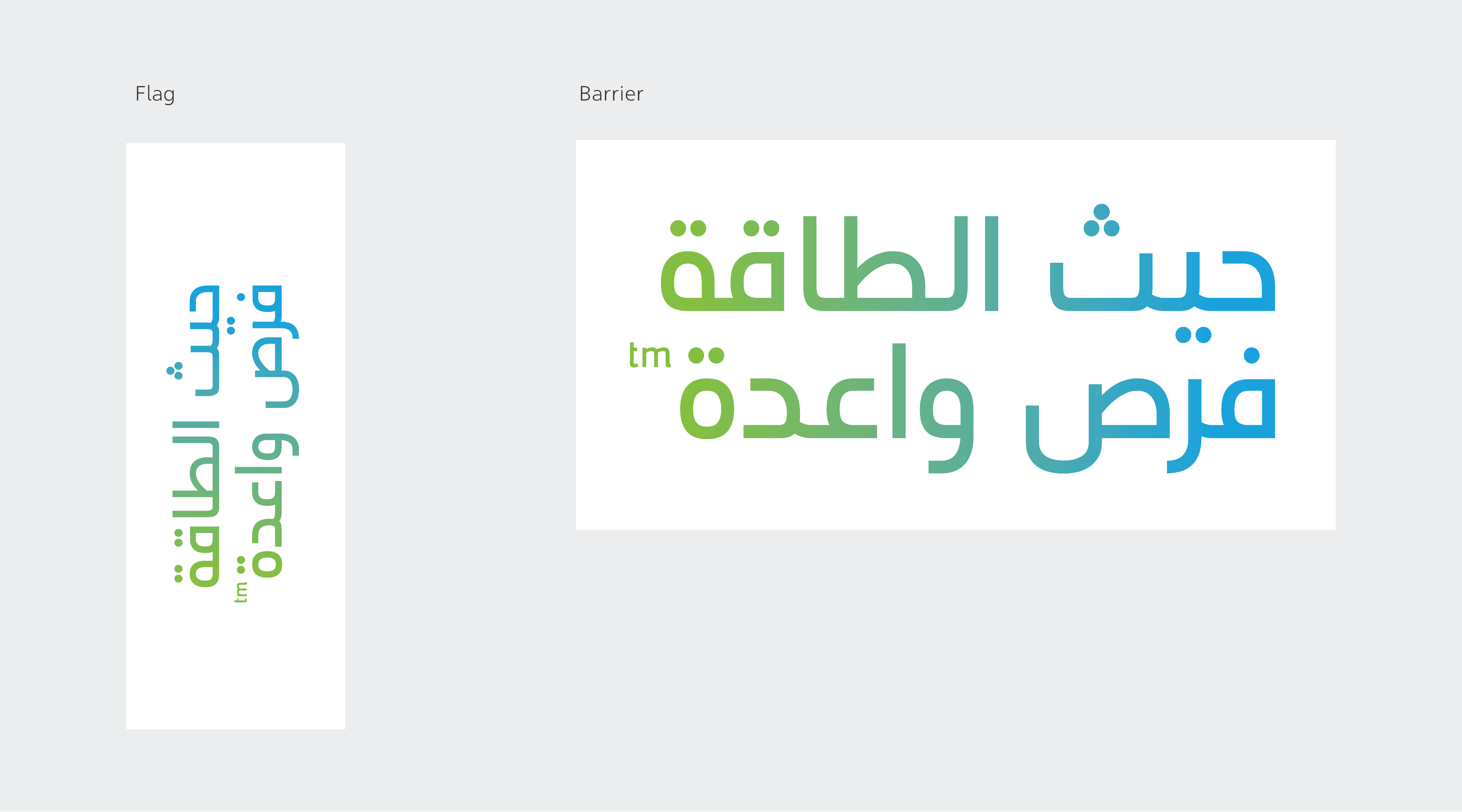
The stacked tagline should be used only in extreme circumstances for communications when space is limited, such as on social media posts, and hoardings at event sponsorship.

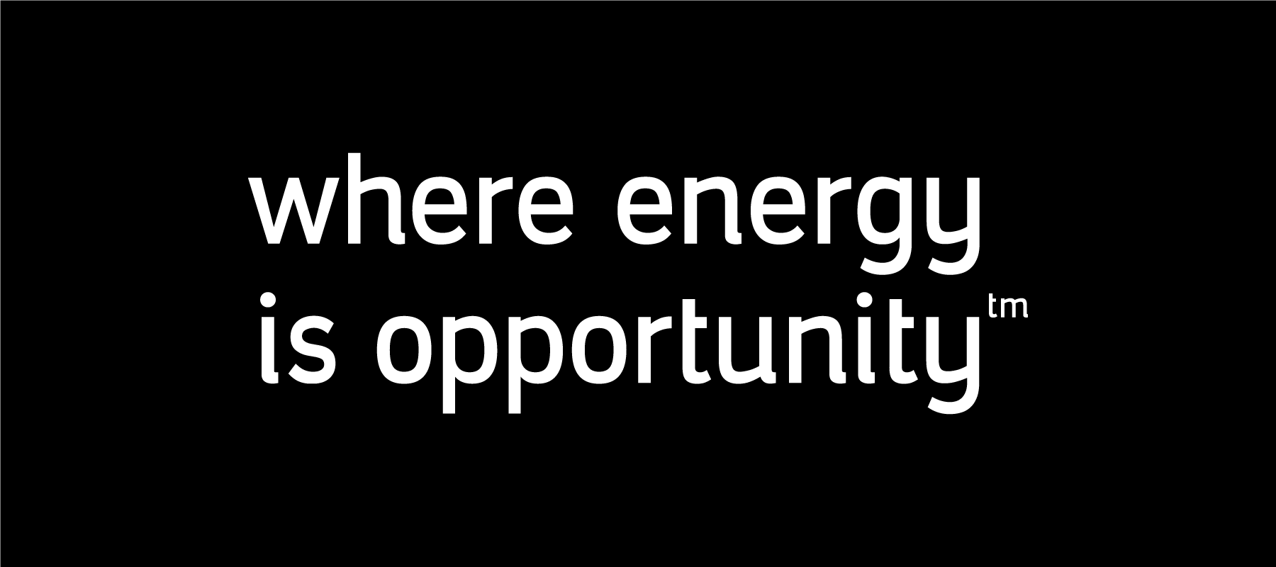
When the gradient cannot be reproduced or printed, the tagline should be in Aramco gray or white.

The tagline should always be used with enough space around it so that it is clearly legible and not obscured by other graphic elements.
The minimum clear space around the tagline is equal to the logo clear space used on the same page. If the logo appears at the top right, the tagline must be aligned at the bottom right.
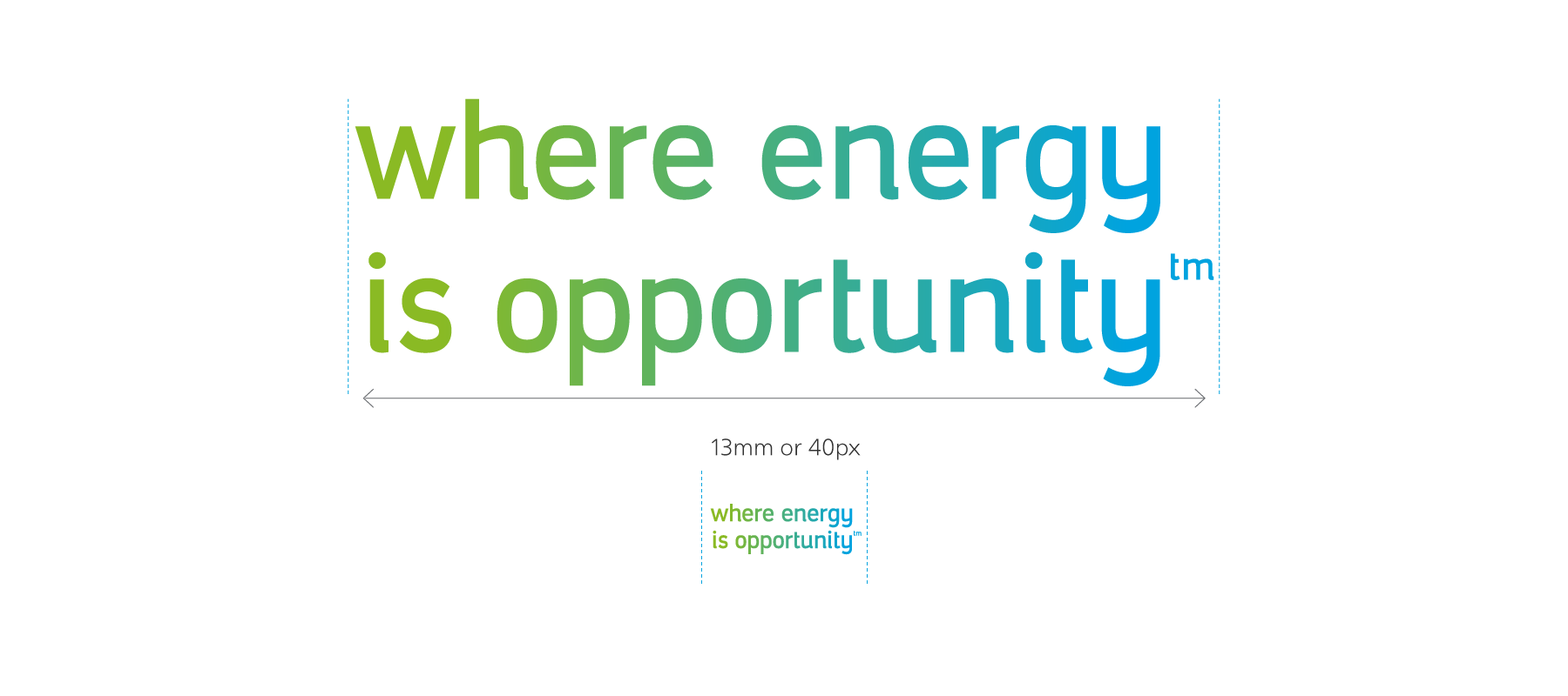
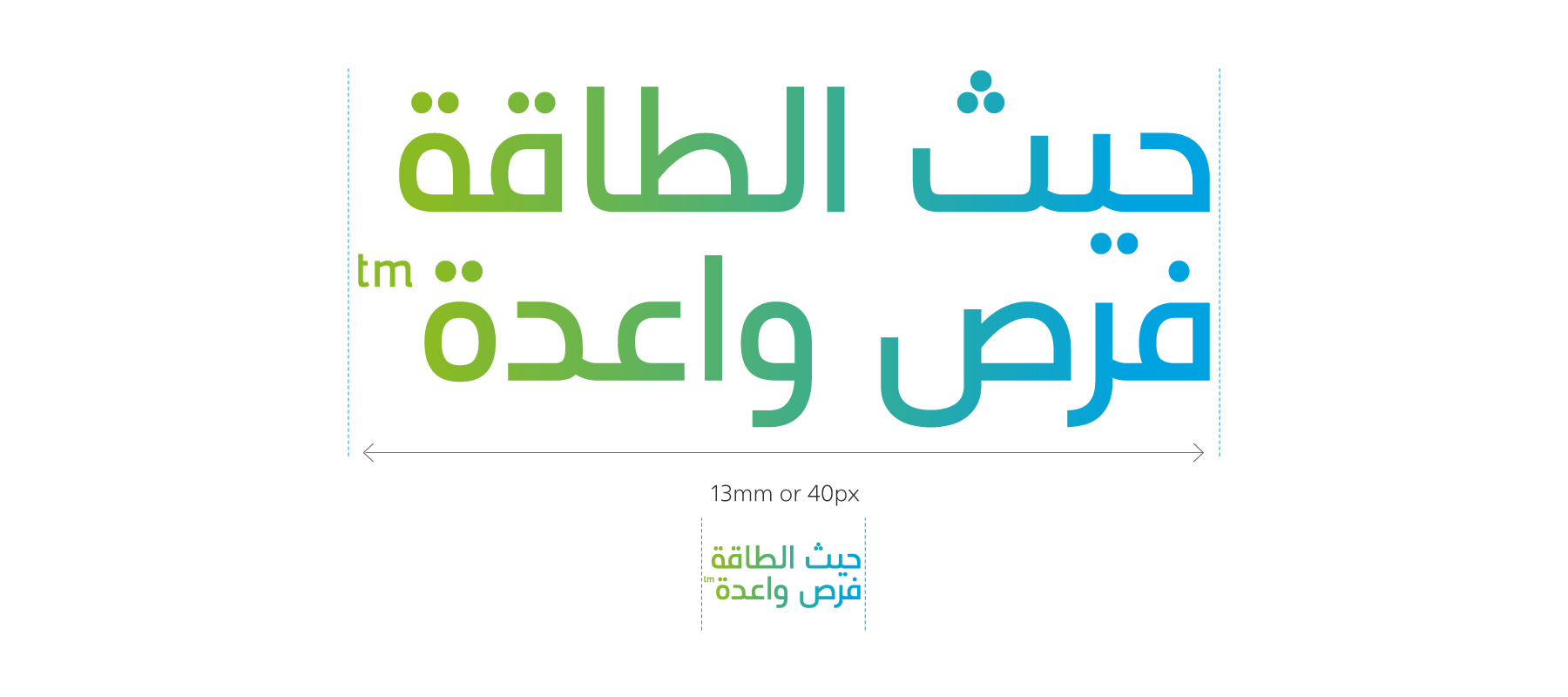
The minimum size of the tagline is 13 millimeters (mm) in print or 40 pixels (px) on screen.
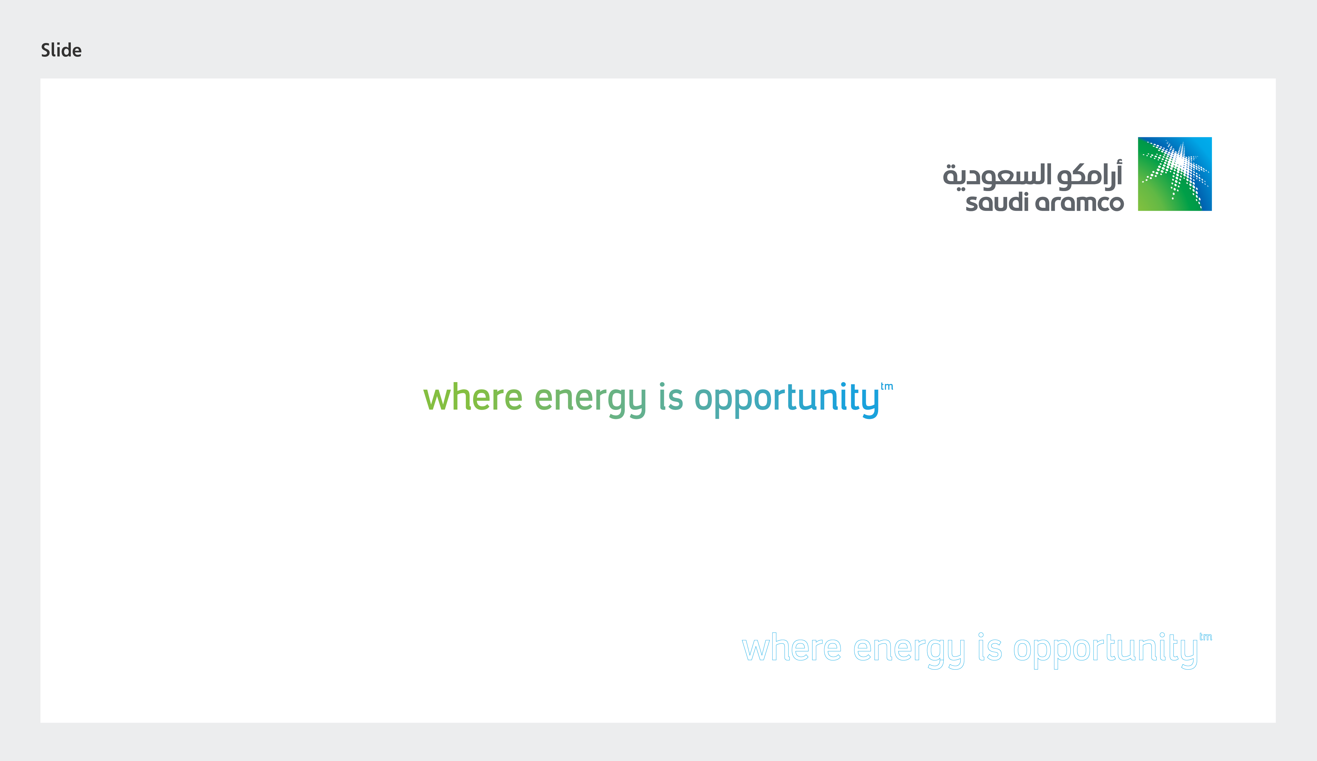
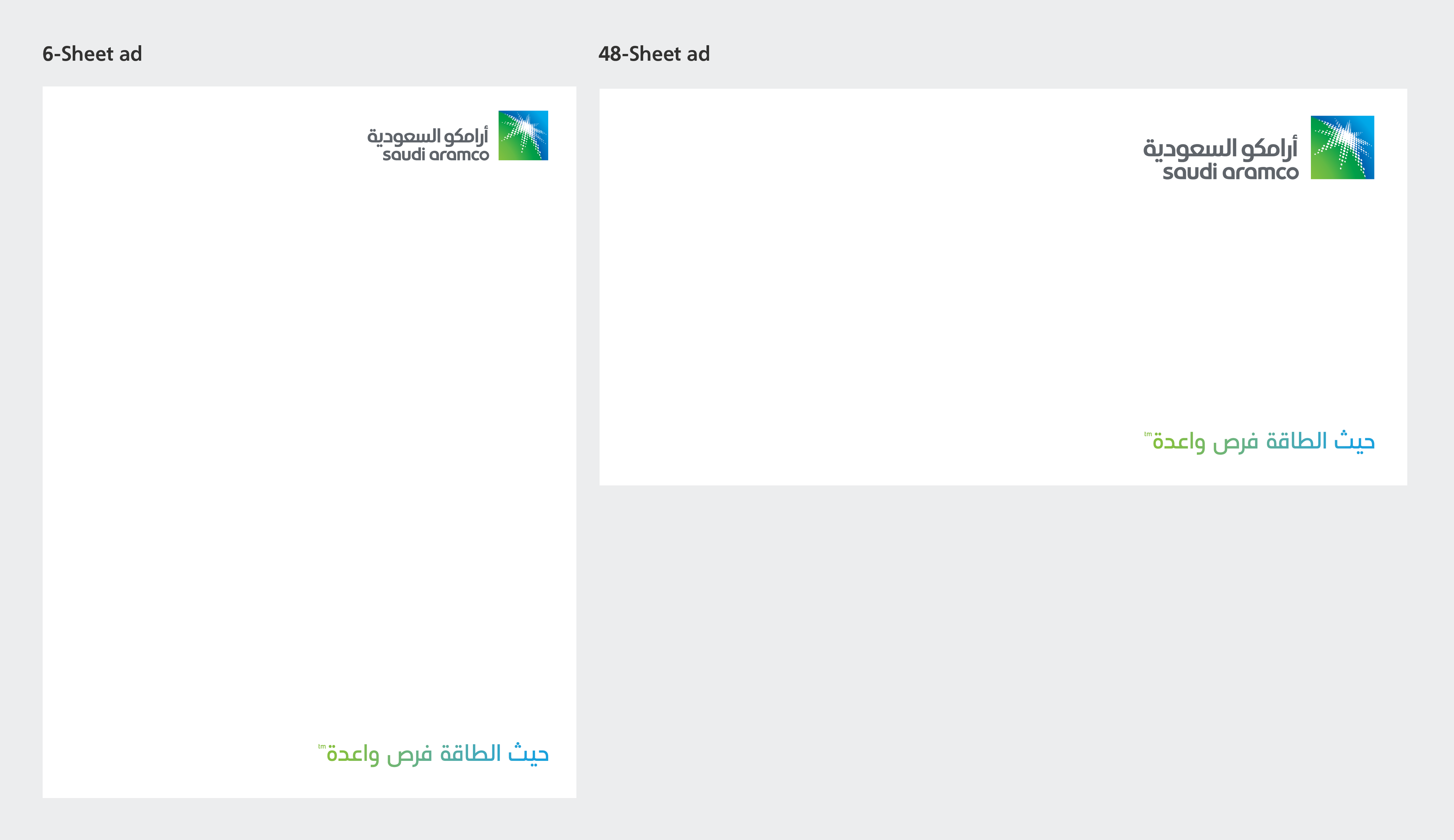
The tagline should typically be placed at the bottom of the format below the logo. When used for sponsorship or digitally it should be centered vertically and horizontally within the given space.
This strong, definitive statement is designed to build an emotional connection with our stakeholders. We are in the opportunity business. Every employee, every initiative, and every facility enables the creation of important new opportunities. The horizontal tagline should be used for most communications and should never be altered. The registered tagline (R) is designed to be used in Kingdom only, while the trademark (tm) is to be used out of Kingdom


The tagline should always be used with enough space around it so that it is clearly legible and not obscured by other graphic elements.
The minimum clear space around the tagline is equal to the logo clear space used on the same page. If the logo appears at the top right, the tagline must be aligned at the bottom right.
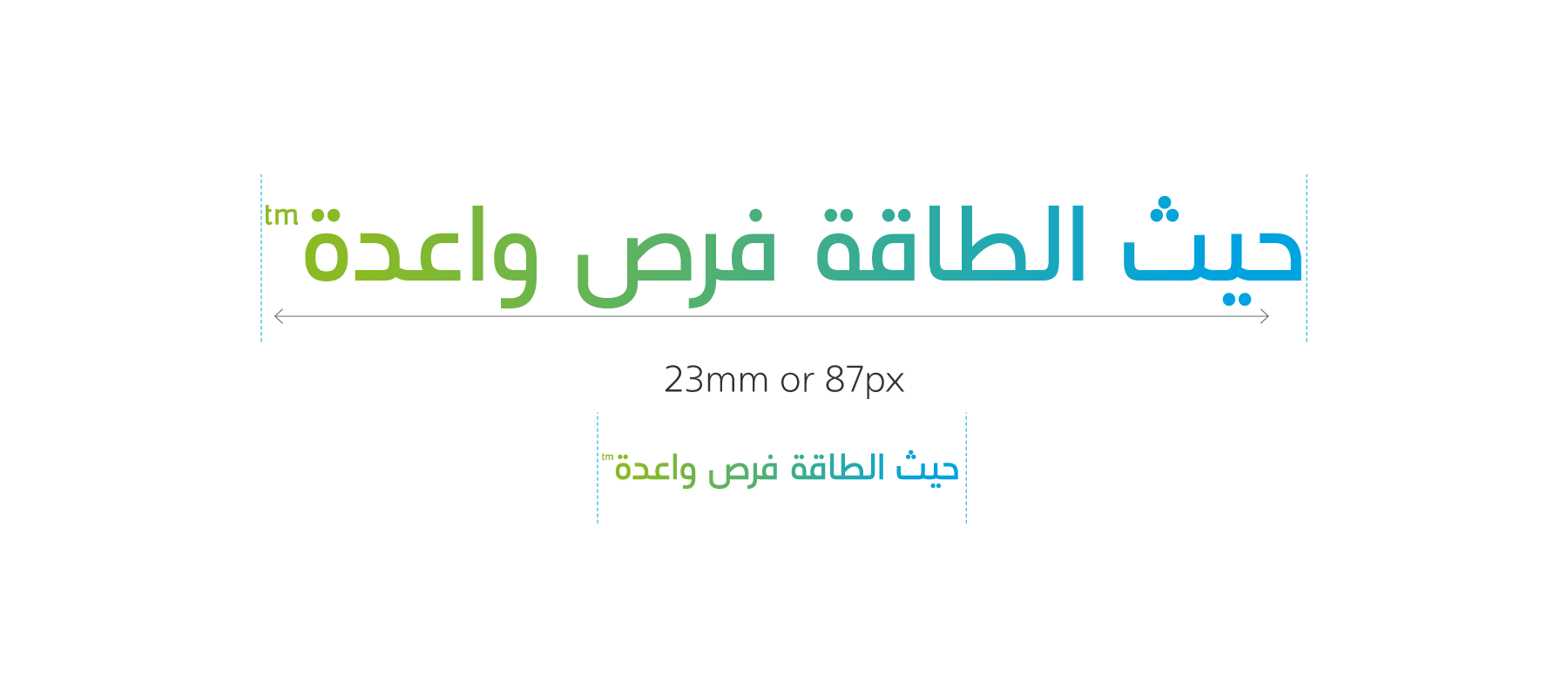
The minimum size of the tagline is 23 millimeters (mm) in print or 87 pixels (px) on screen.
The stacked tagline should be used only in extreme circumstances for communications when space is limited, such as on social media posts, and hoardings at event sponsorship.
When the gradient can’t be produced or printed, the tagline should be in Aramco gray or White.
The tagline should always be used with enough space around it so that it is clearly legible and not obscured by other graphic elements.
The minimum clear space around the tagline is equal to the logo clear space used on the same page. If the logo appears on the top right, the tagline must be aligned bottom right.
The minimum size of the tagline is 13mm in print or 40px on screen.
The tagline should typically be placed at the top right whenever possible. When used for sponsorship or digital, it can be centered vertically and horizontally within the given space.
Our tagline is a belief statement that informs everything we do. Because there is so much meaning invested in our tagline, we need to use it appropriately. Use the questions below to guide your decision.

