-
search
This logo comprises two elements: the Aramco wordmark in English and the energy burst symbol. They are both fixed elements whose positions should never be altered. There is a positive version for use on light backgrounds, and a reverse version, with a white stroke around the symbol, for use on dark backgrounds. A hybrid version with positive wordmark and white key-line around the symbol is also available for video usage only.
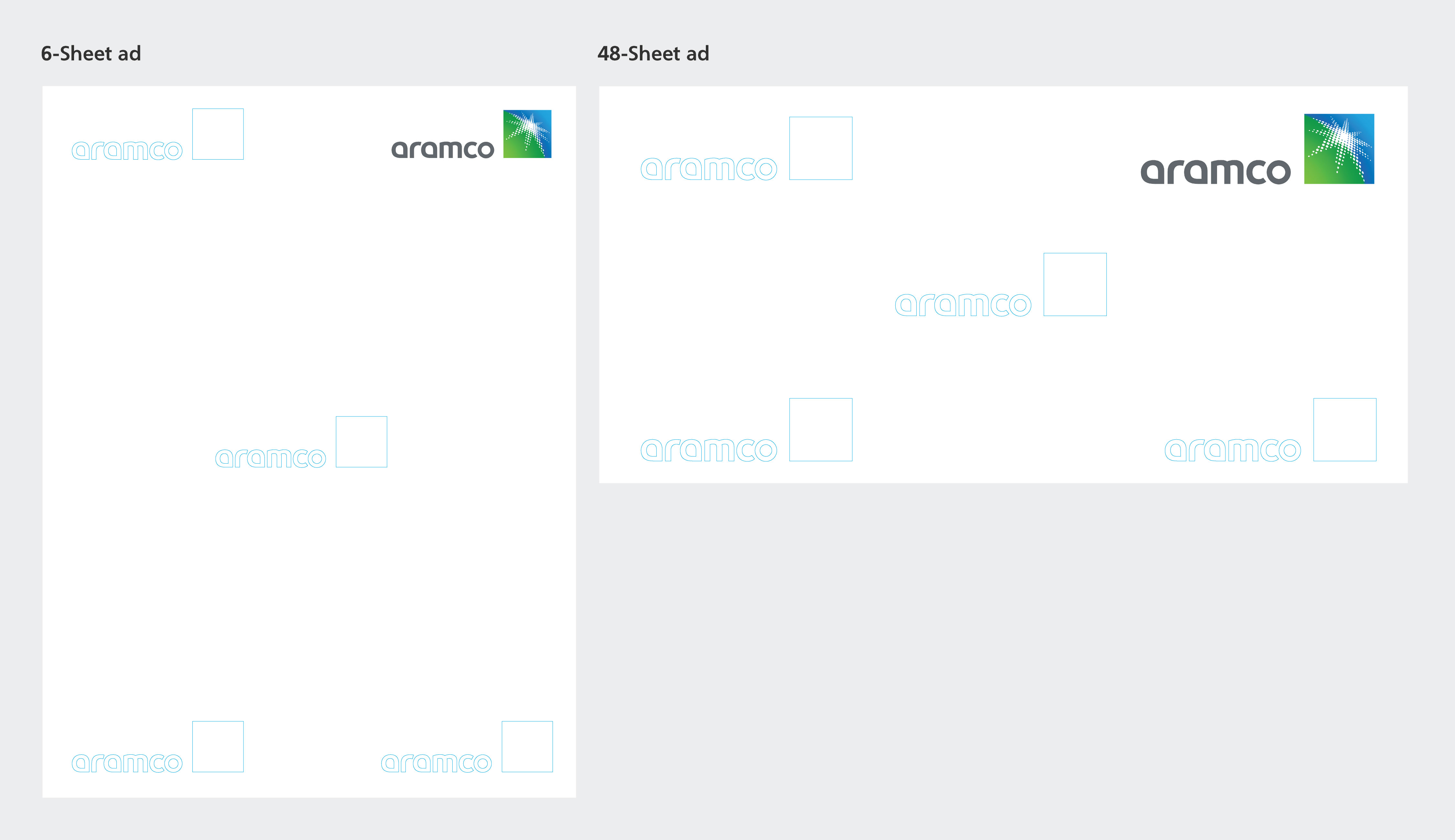
The logo should typically be placed in the top right corner, whenever there are other elements on the page, regardless of whether the accompanying text is in Arabic or English.
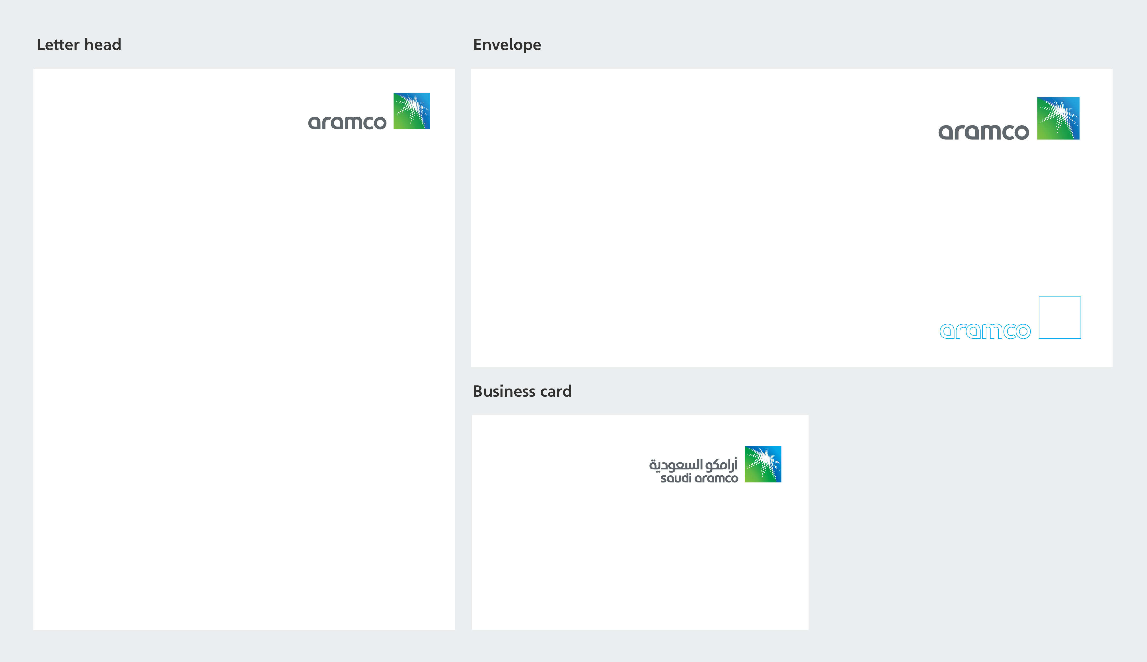
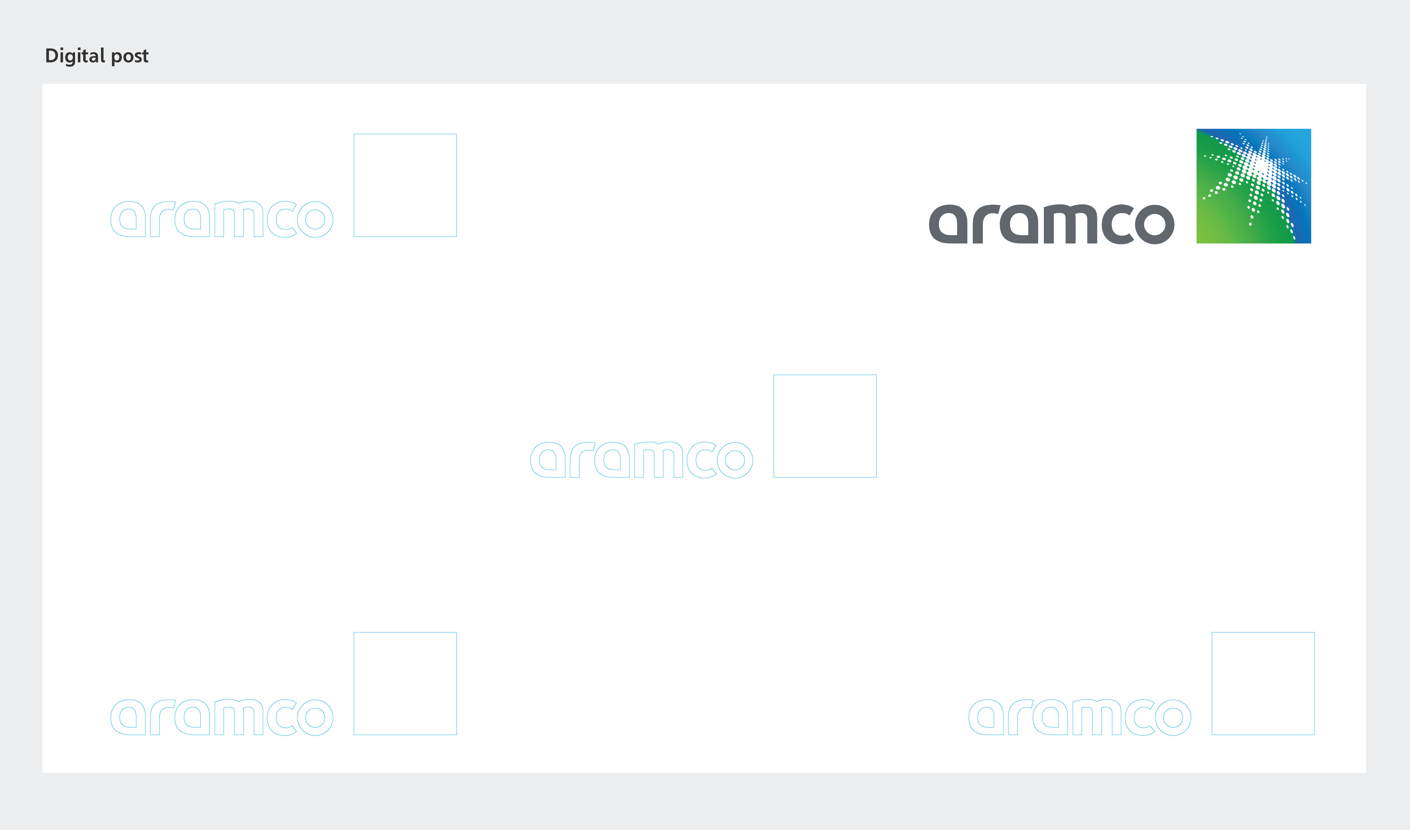
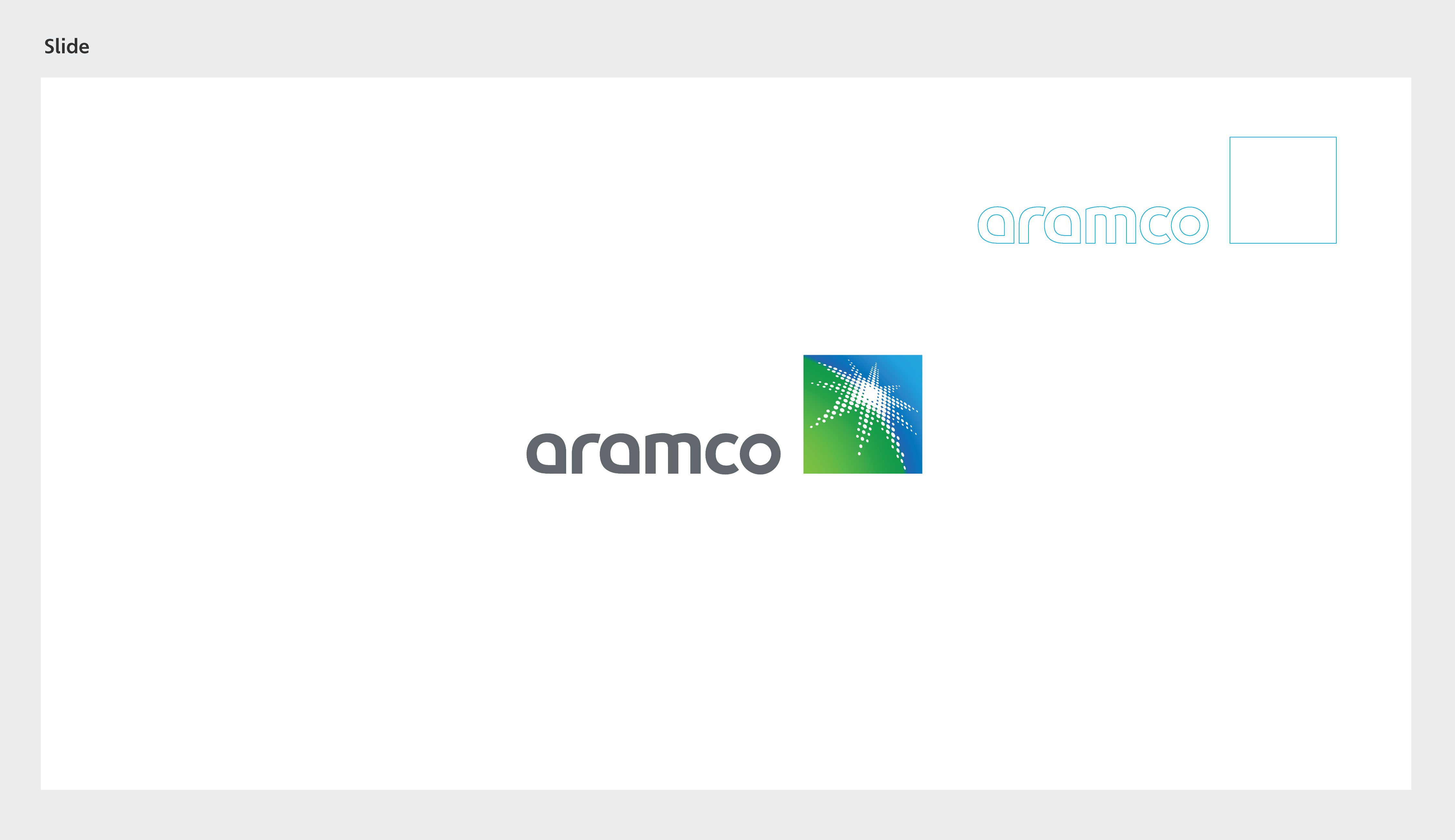
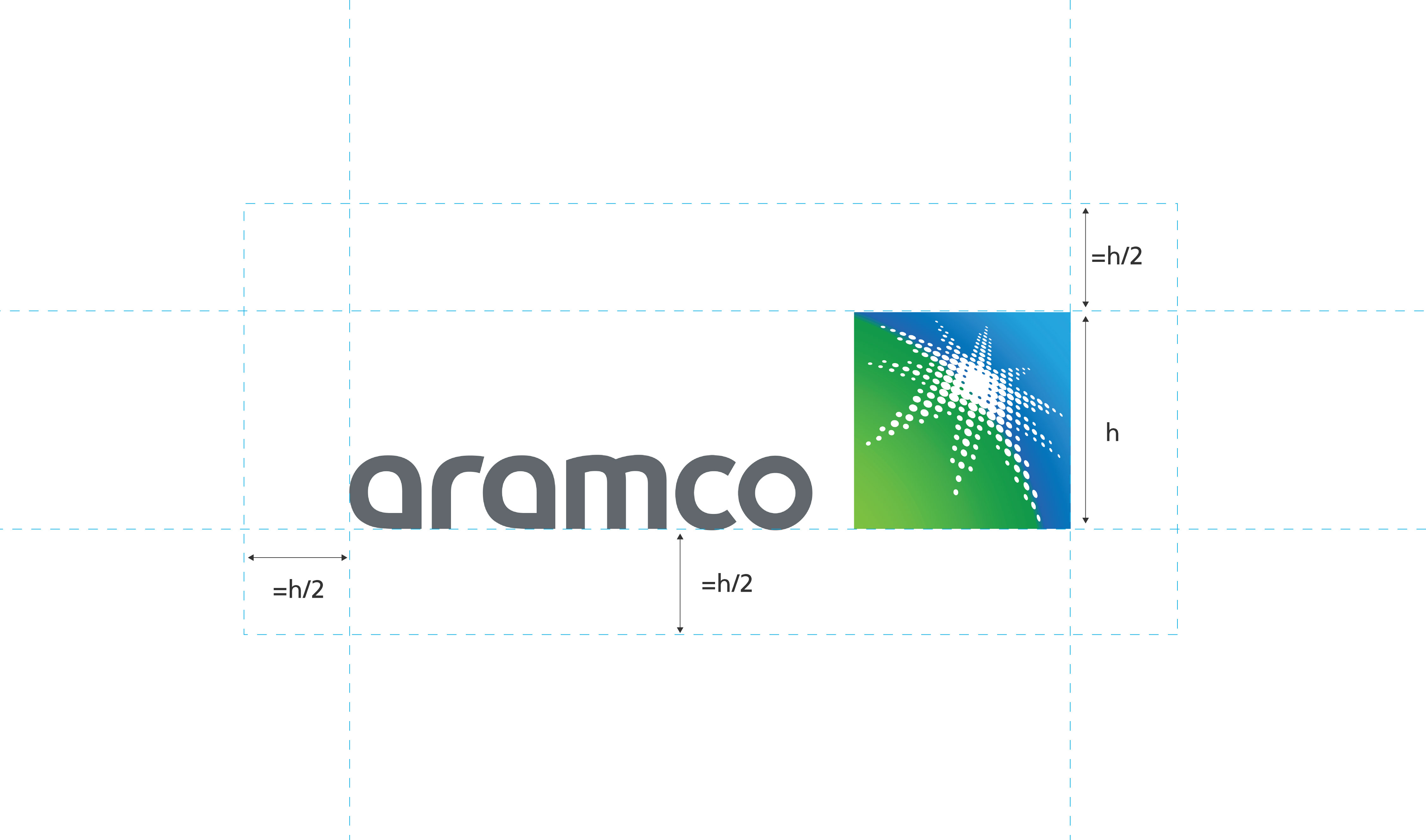
The logo should always be used with enough space around it so that it is clearly legible and not obscured by other graphic elements.
The minimum clear space around the logo is equal to the logo's height [h] divided by two.
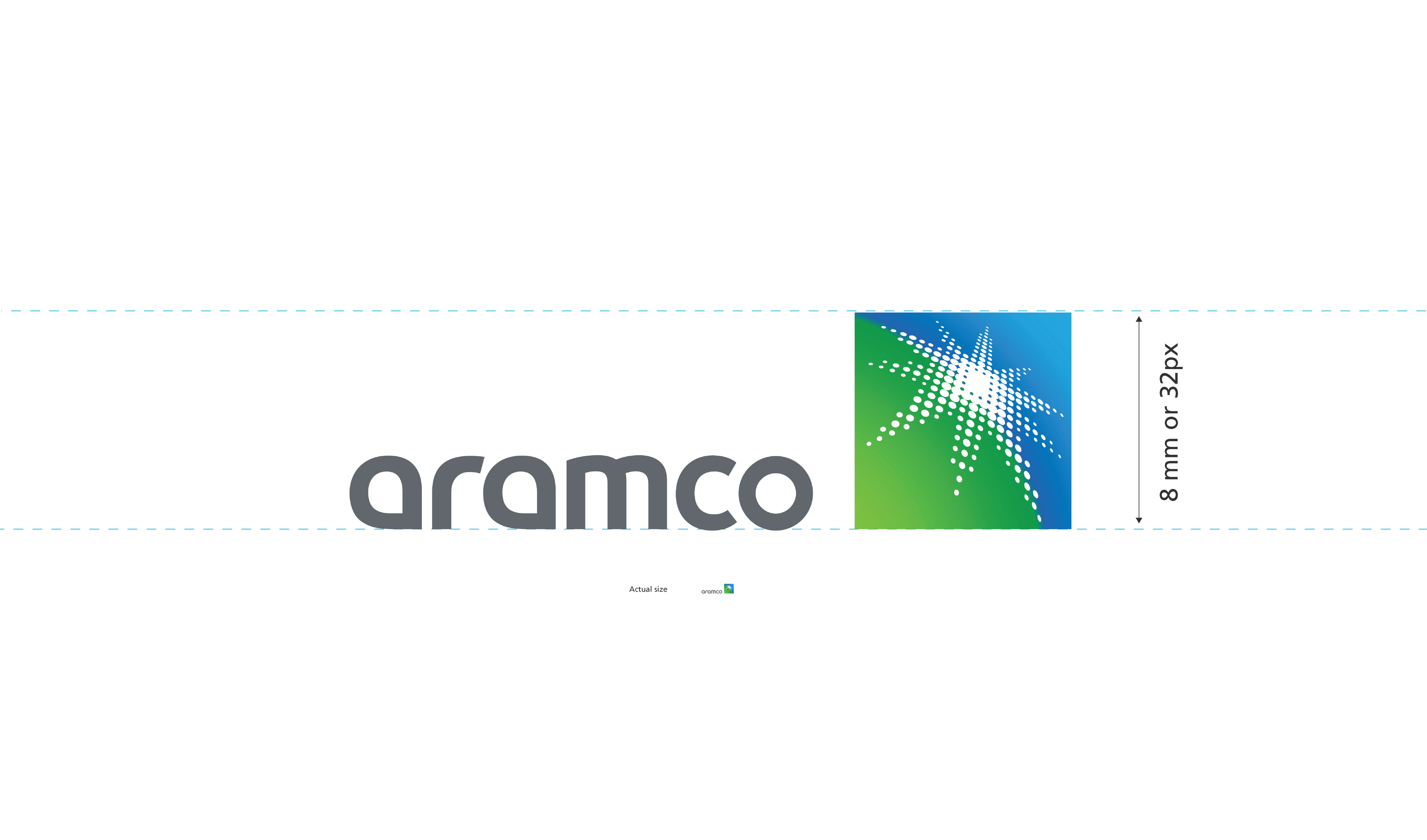
The absolute minimum size of the global market-facing logo is 8 millimeters (mm) in print or 35 pixels (px) on screen. The minimum size is determined by the document viewed at 100% on screen printed at full size.
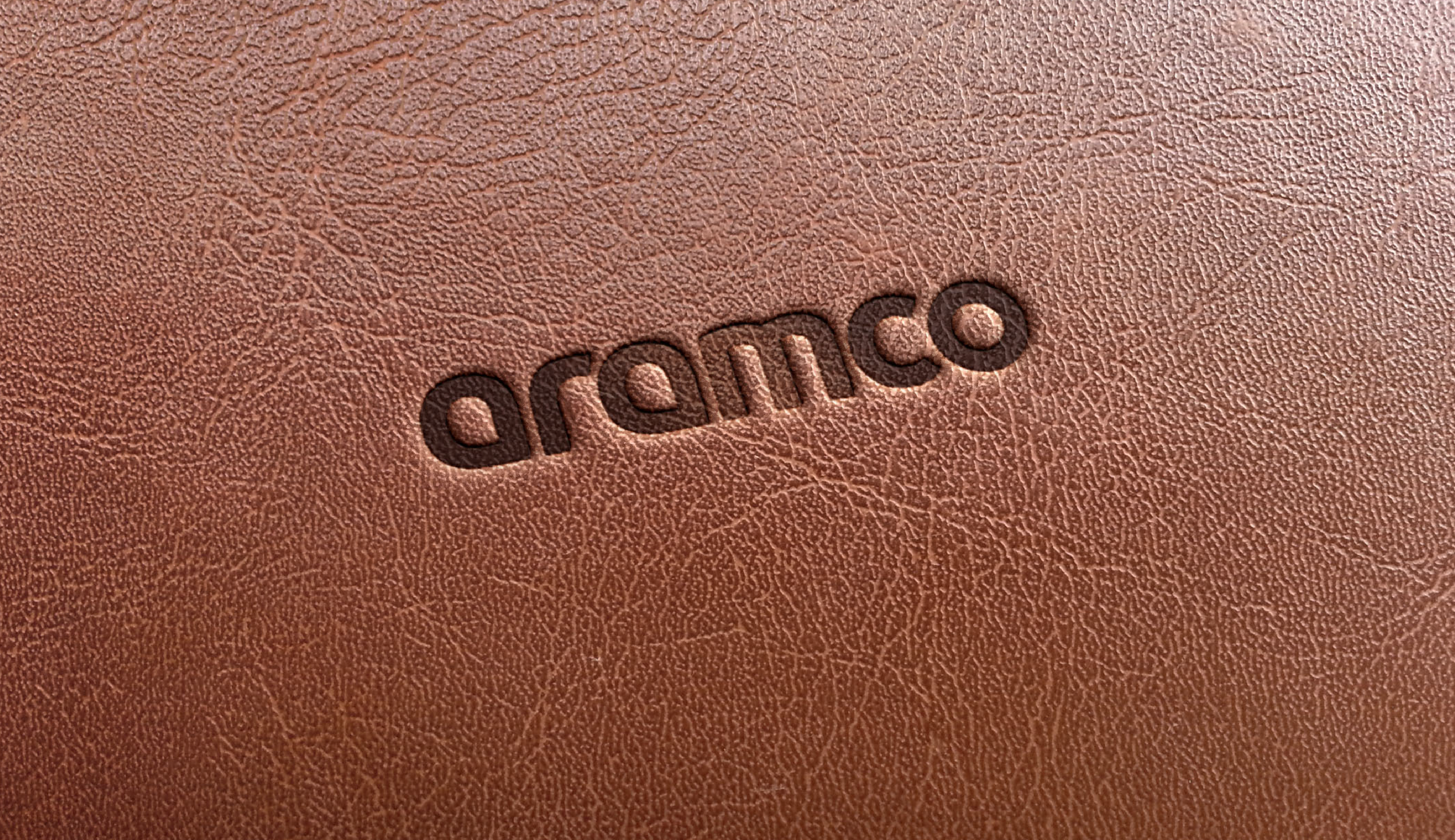
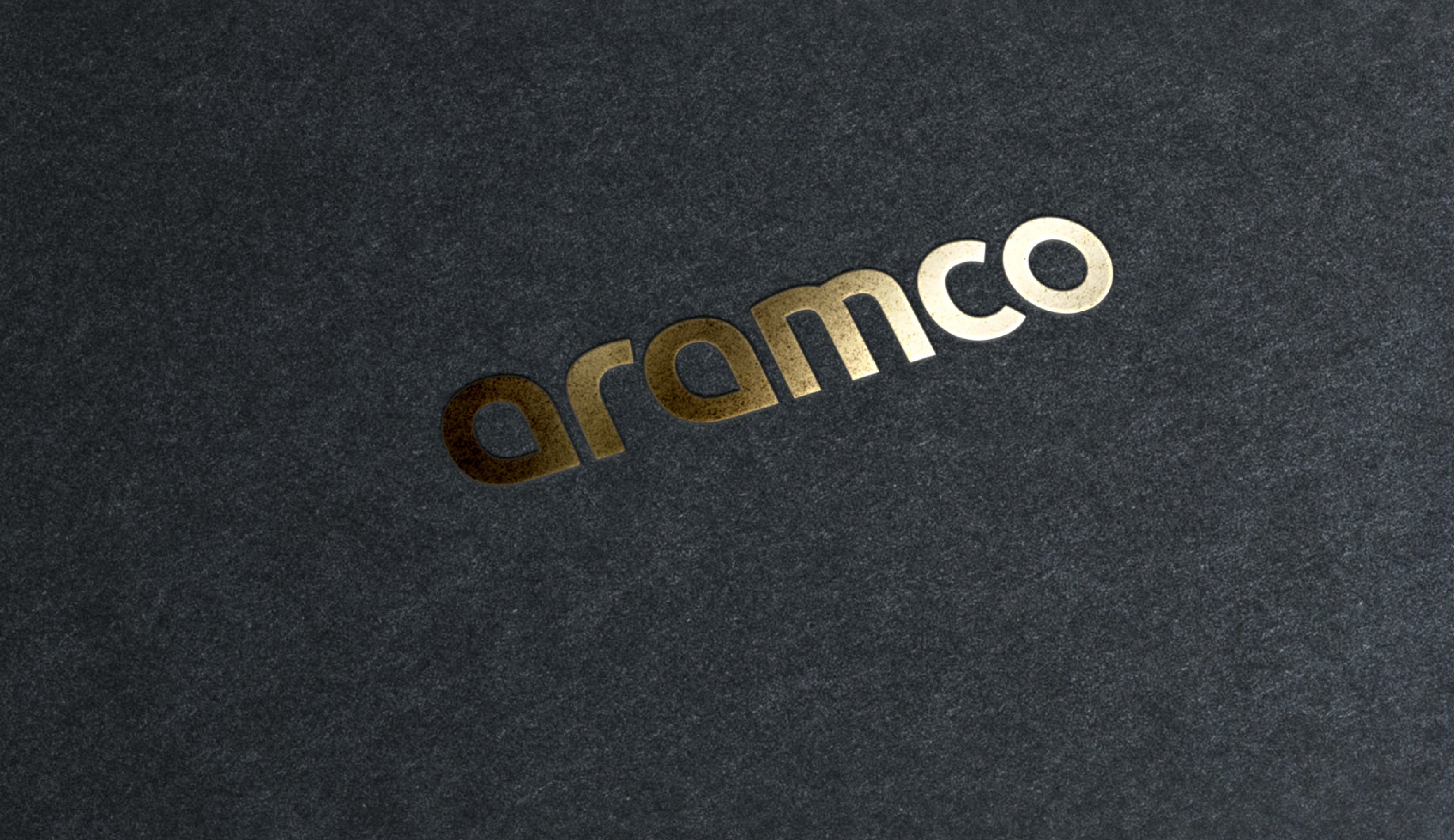
All special finishes that require a one-color version of our identity use the word mark only. For impact, make sure there is sufficient contrast between the finish and the substrate. Special finishes may be used for premium applications, such as CEO collateral. The examples on the left illustrate how we use the word mark for various reproduction finishes.
Do not use our symbol if the application does not allow for effective reproduction.


The global market-facing visual system should be expressive and approachable.