-
search

Our Logo is a unique expression of how we bring energy to life. The Symbol represents a powerful burst of energy on the horizon line where land meets sky. The logo comprises two core elements: the logotype in Arabic and English, and the energy Symbol. They are both fixed elements and their proportions and position should never be altered.
The logo should typically be placed in the top right corner on a given page, whenever there are other elements on the page, regardless of whether other text is in Arabic or English.
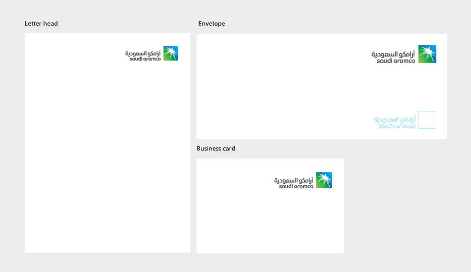
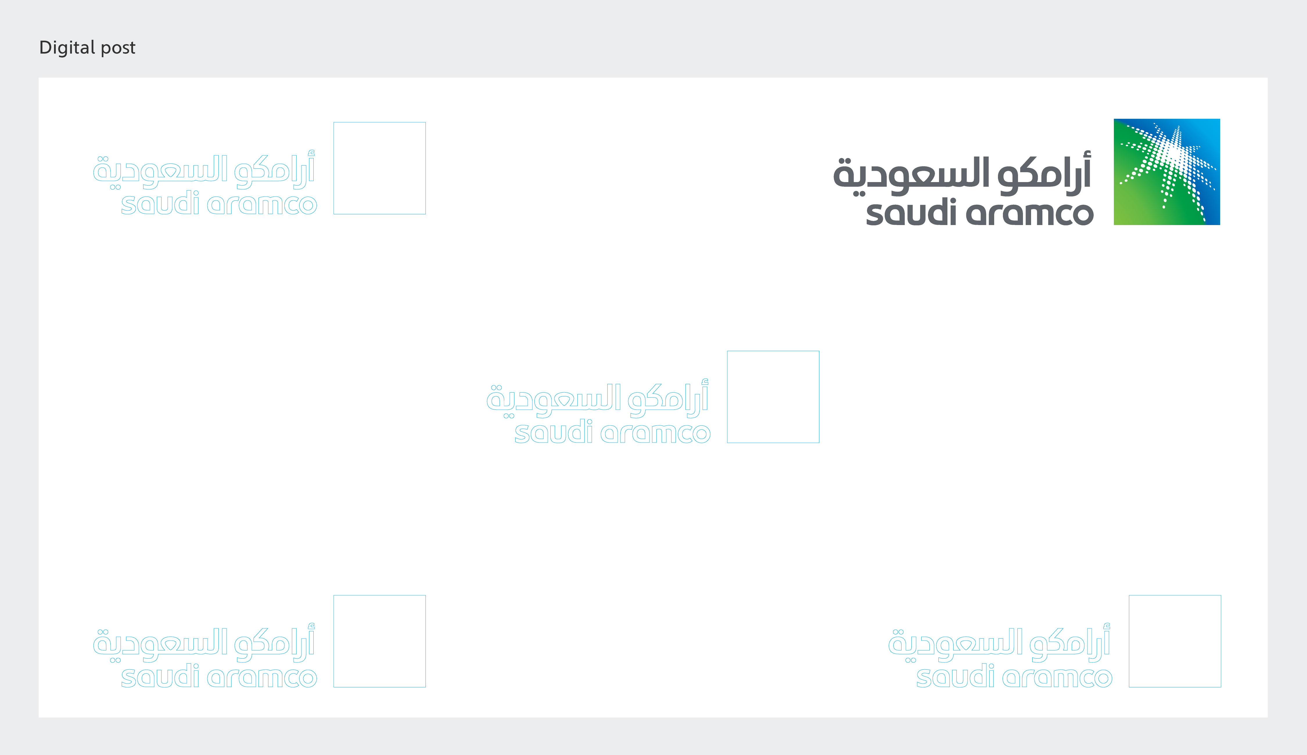
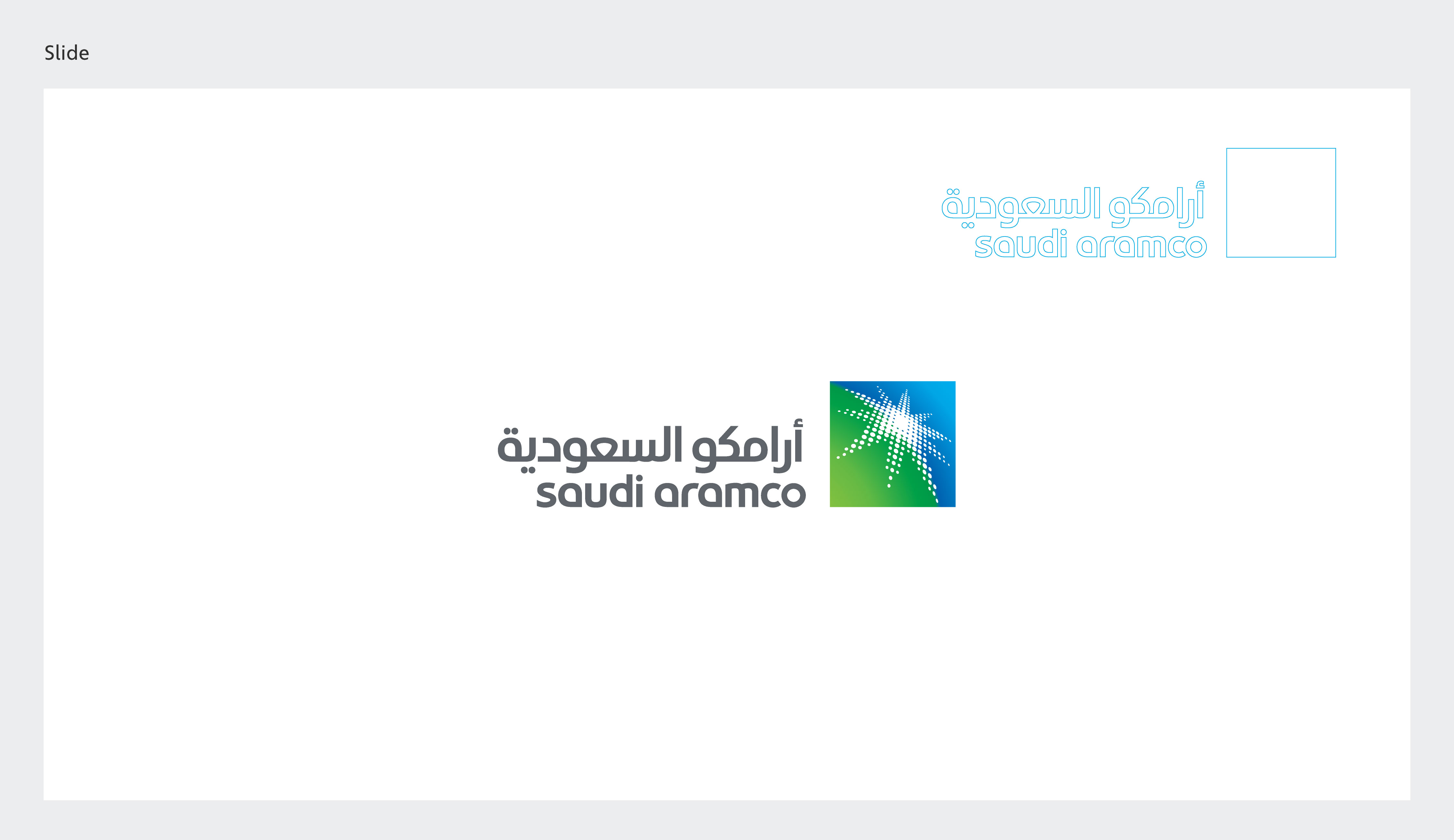
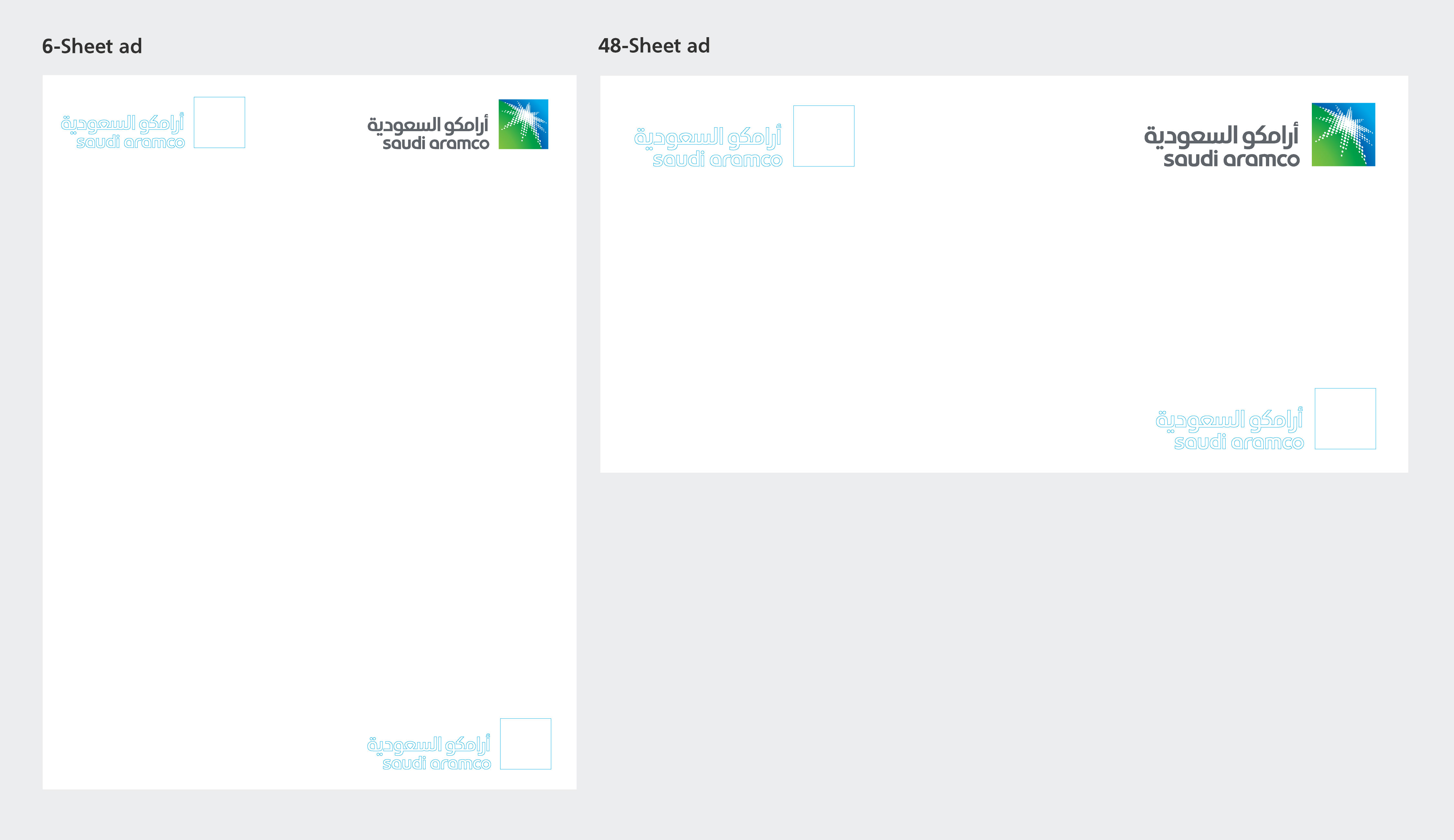
The institutional logo should always be used with enough space around it so that it is clearly legible and not obscured by other graphic elements.
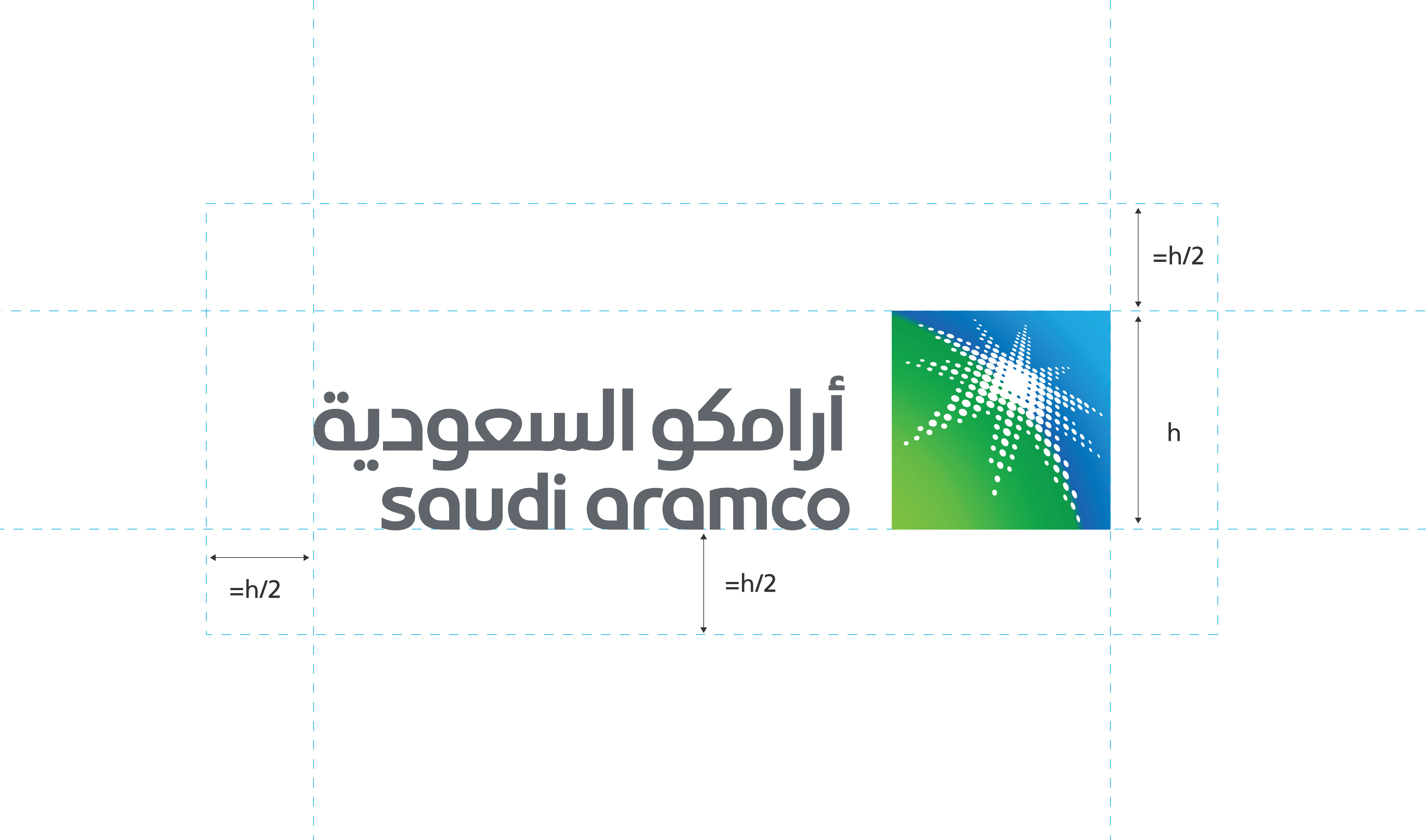
The minimum clear space around the logo is equal to the logo's height [h] divided by two.
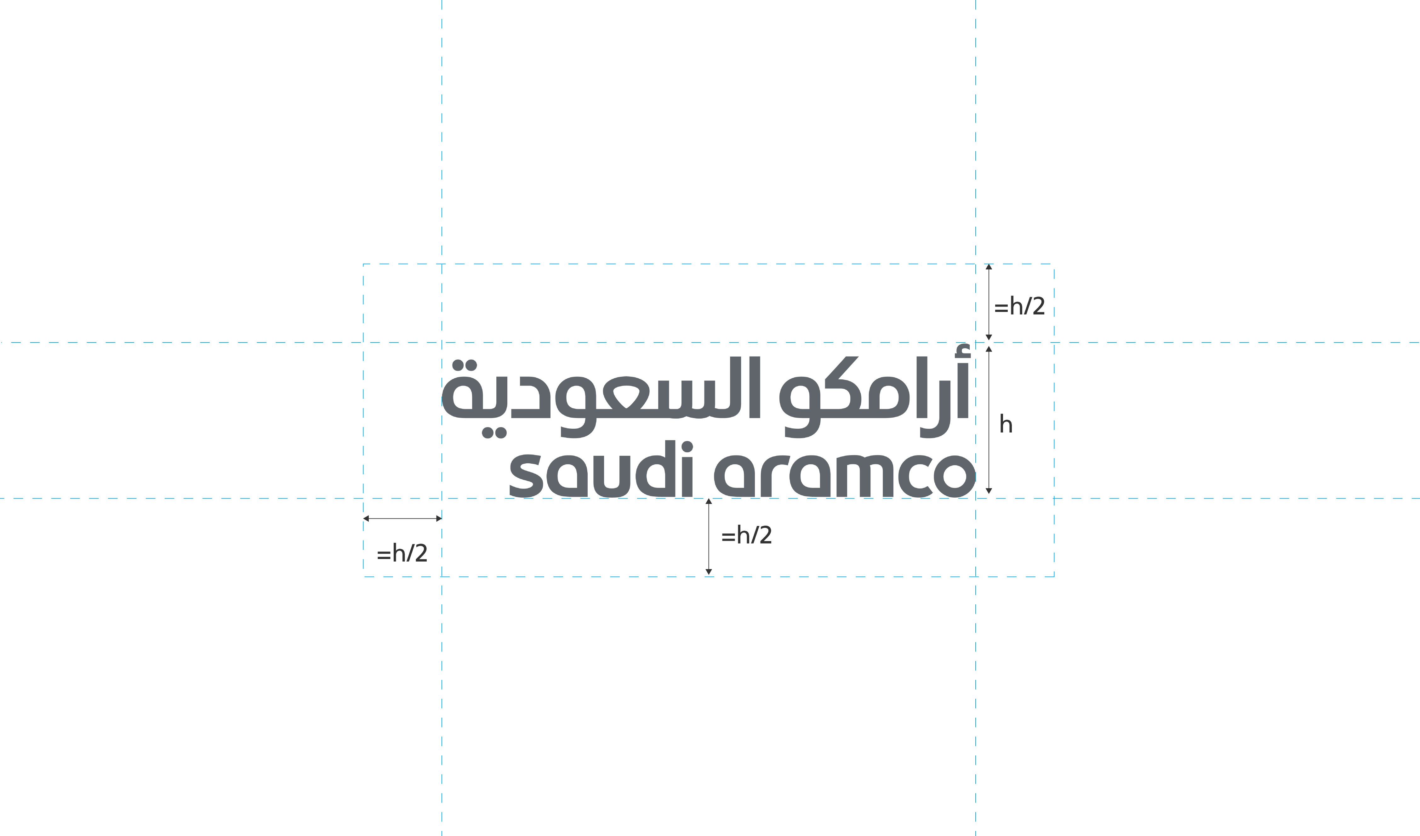
The minimum clear space around the logo is equal to the logo's height [h] divided by two.

The absolute minimum size of the institutional logo is 8 millimeters (mm) in print or 32 pixels (px) on screen. The minimum size is determined by the document viewed at 100% on screen printed at full size.
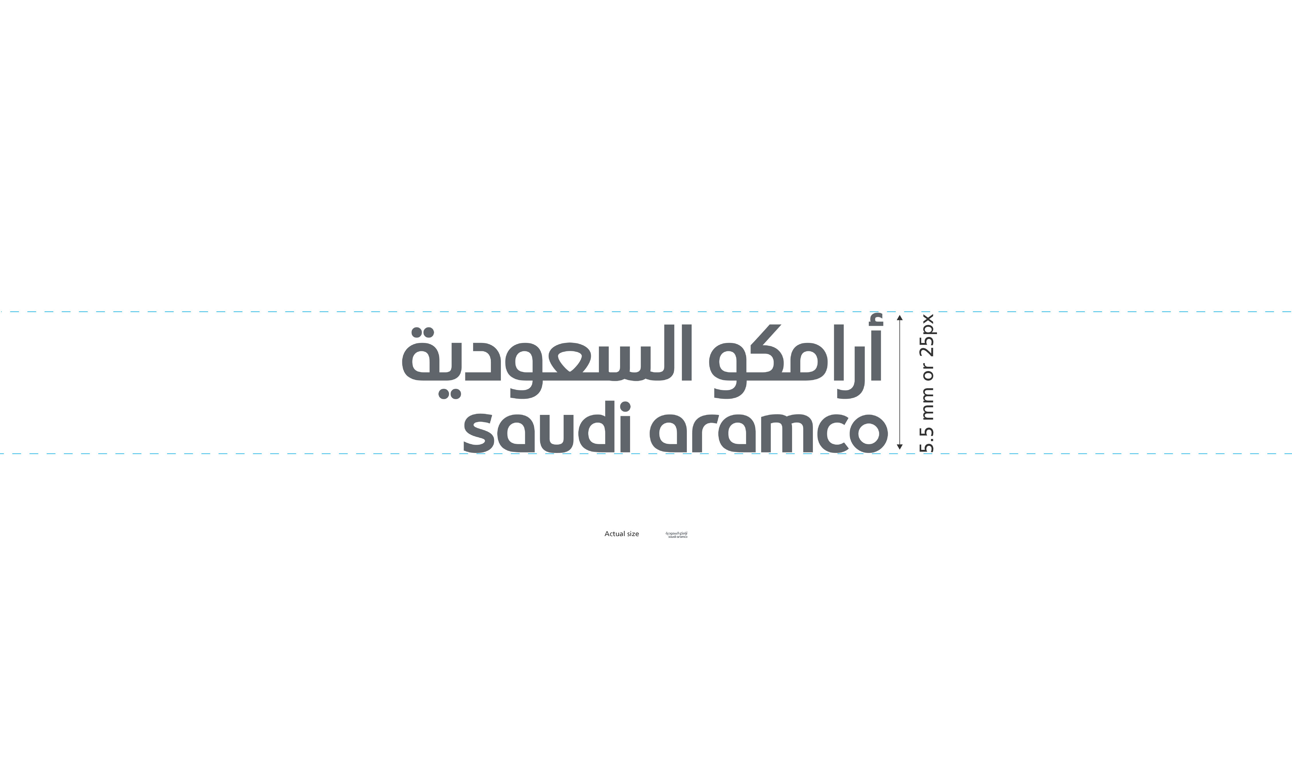
The absolute minimum size of the institutional wordmark is 5.5 millimeters (mm) in print or 25 pixels (px) on screen. The minimum size is determined by the document viewed at 100% on screen printed at full size.
All special finishes that require a one-color version of our identity use the word mark only. For impact, make sure there is sufficient contrast between the finish and the substrate. Special finishes may be used for premium applications, such as CEO collateral. The examples on the left illustrate how we use the word mark for various reproduction finishes.
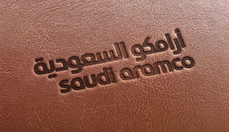
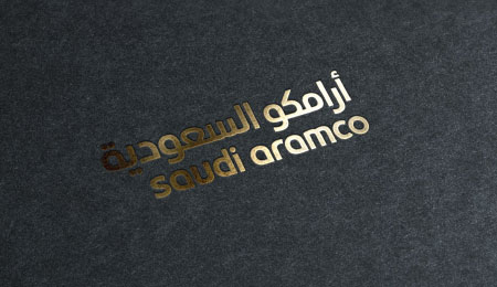
Do not use our symbol if the application does not allow for effective reproduction.
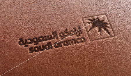
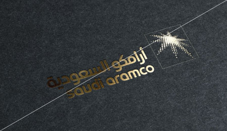
For physical signage at events and other spatial applications, the wordmark and symbol can be separated. In these circumstances the wordmark and symbol should be placed at opposing sides with an exclusive clear space around. The space between the wordmark and symbol differ depending on the format and size. If both elements are less than five symbols distant, the normal lockup should be used.
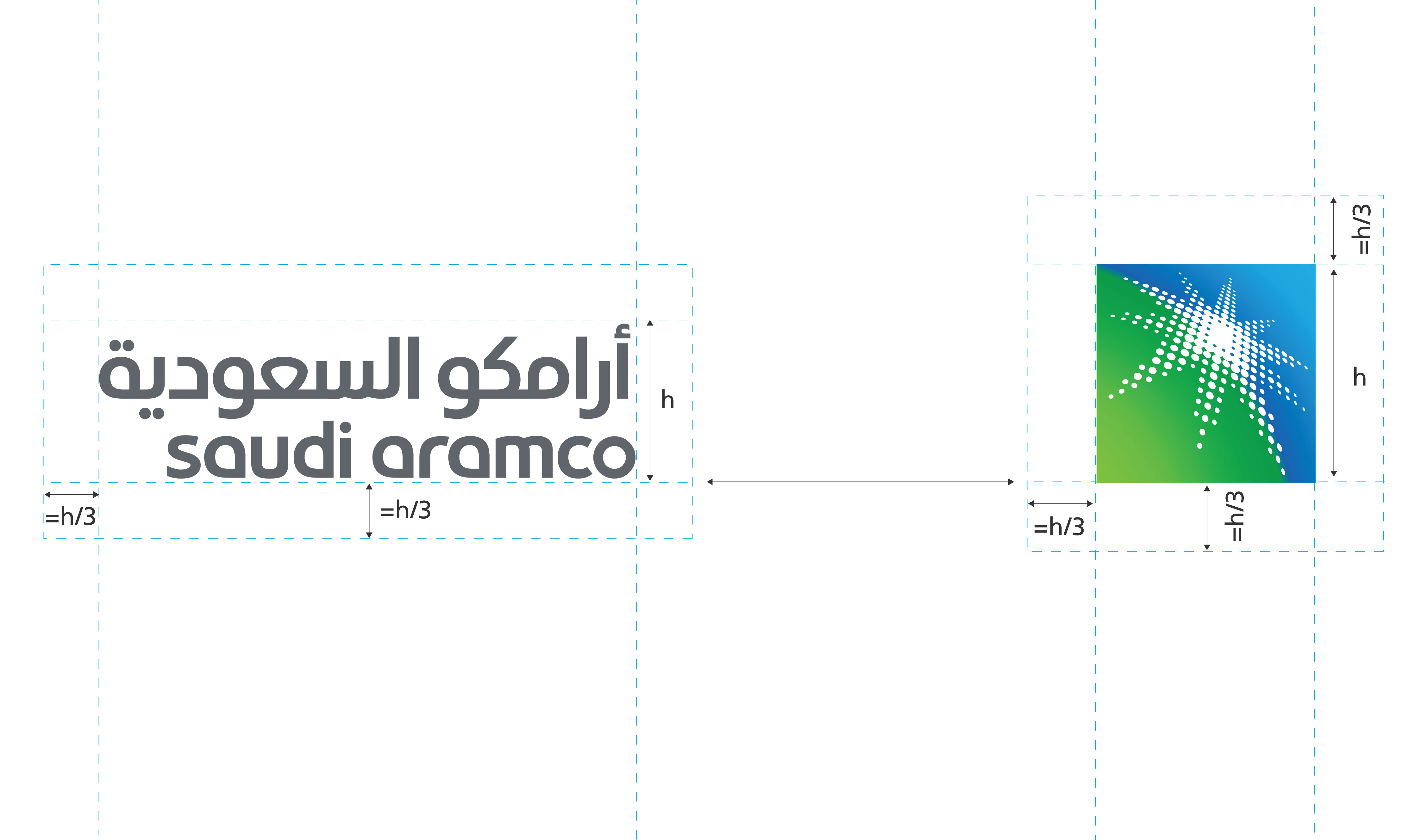
The institutional wordmark should be vertically centered, with the baseline of the English letter forms creating an imaginary line drawn to the bottom of the symbol.
The symbol should be vertically centered to the structure where the symbol is based, and should always appear to the right of the institutional wordmark.
When it is not possible to reproduce the full institutional logo due the nature of the symbol, the institutional wordmark can be used. This should typically be placed at the top right. However, it can alternatively be used in the center or bottom right on windows and doors, if appropriate, to increase visibility.
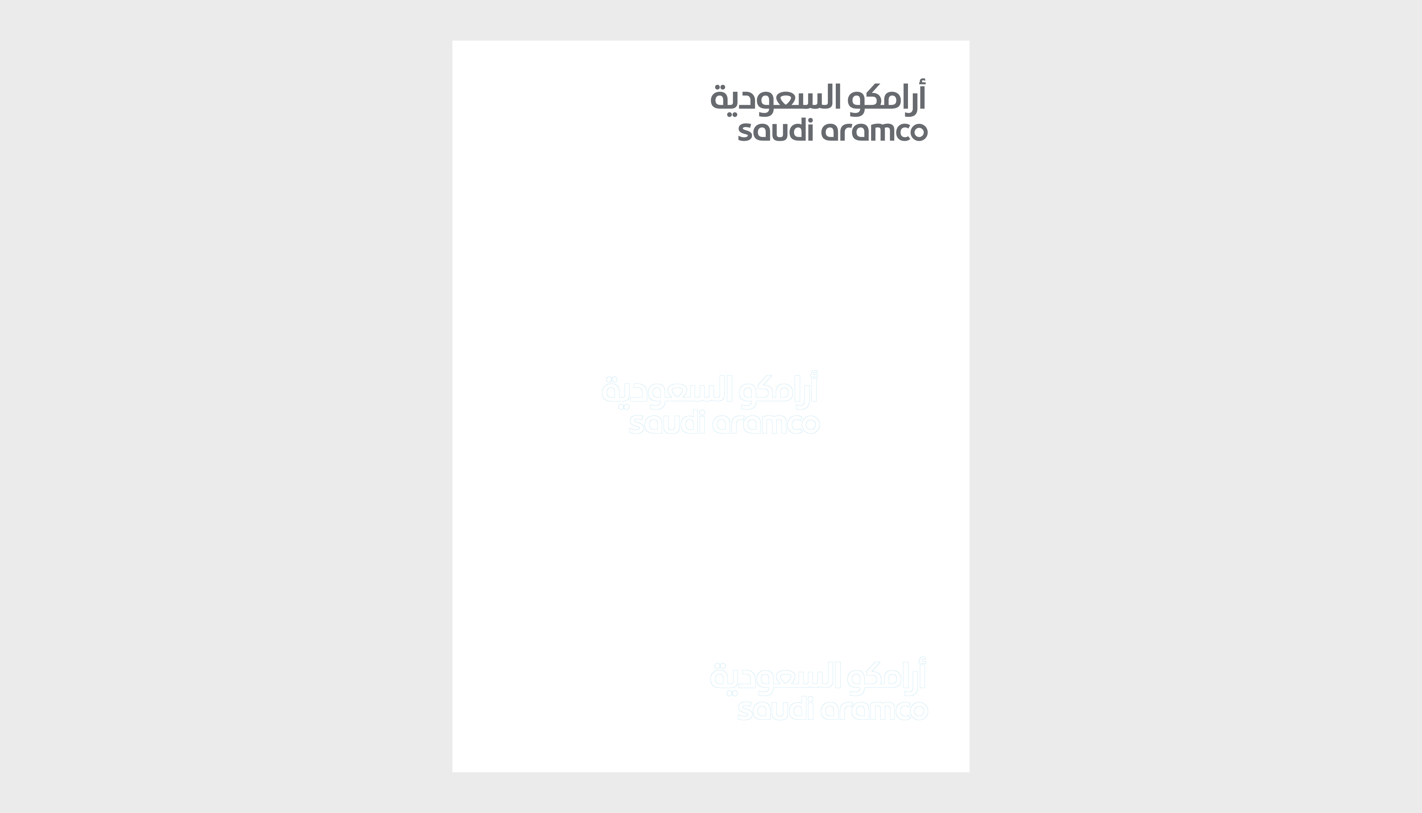
The institutional wordmark should be placed on the top, bottom, or center right, depending on which position has the most prominence.
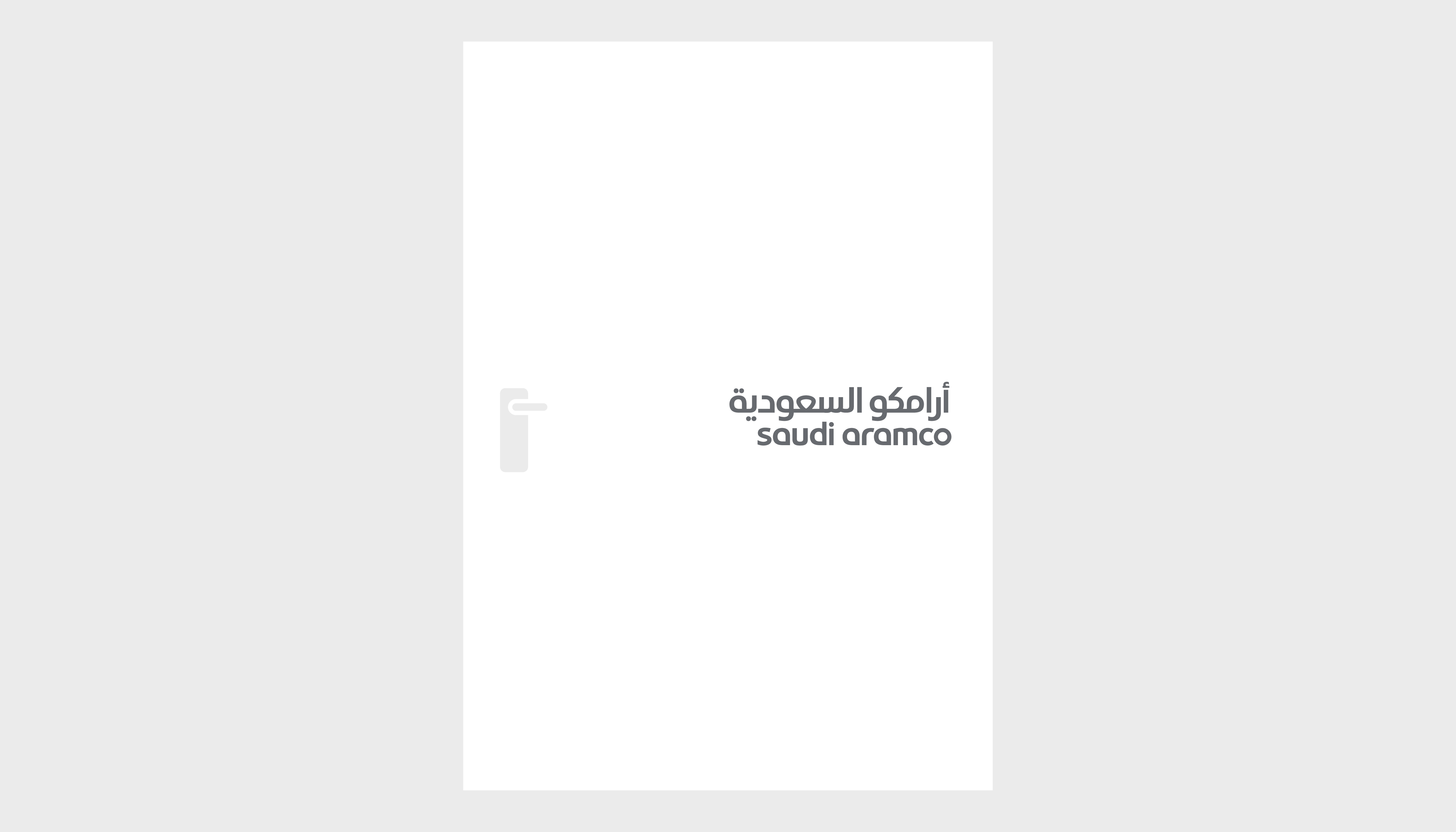
The institutional wordmark should be placed in clear view in the center right position.
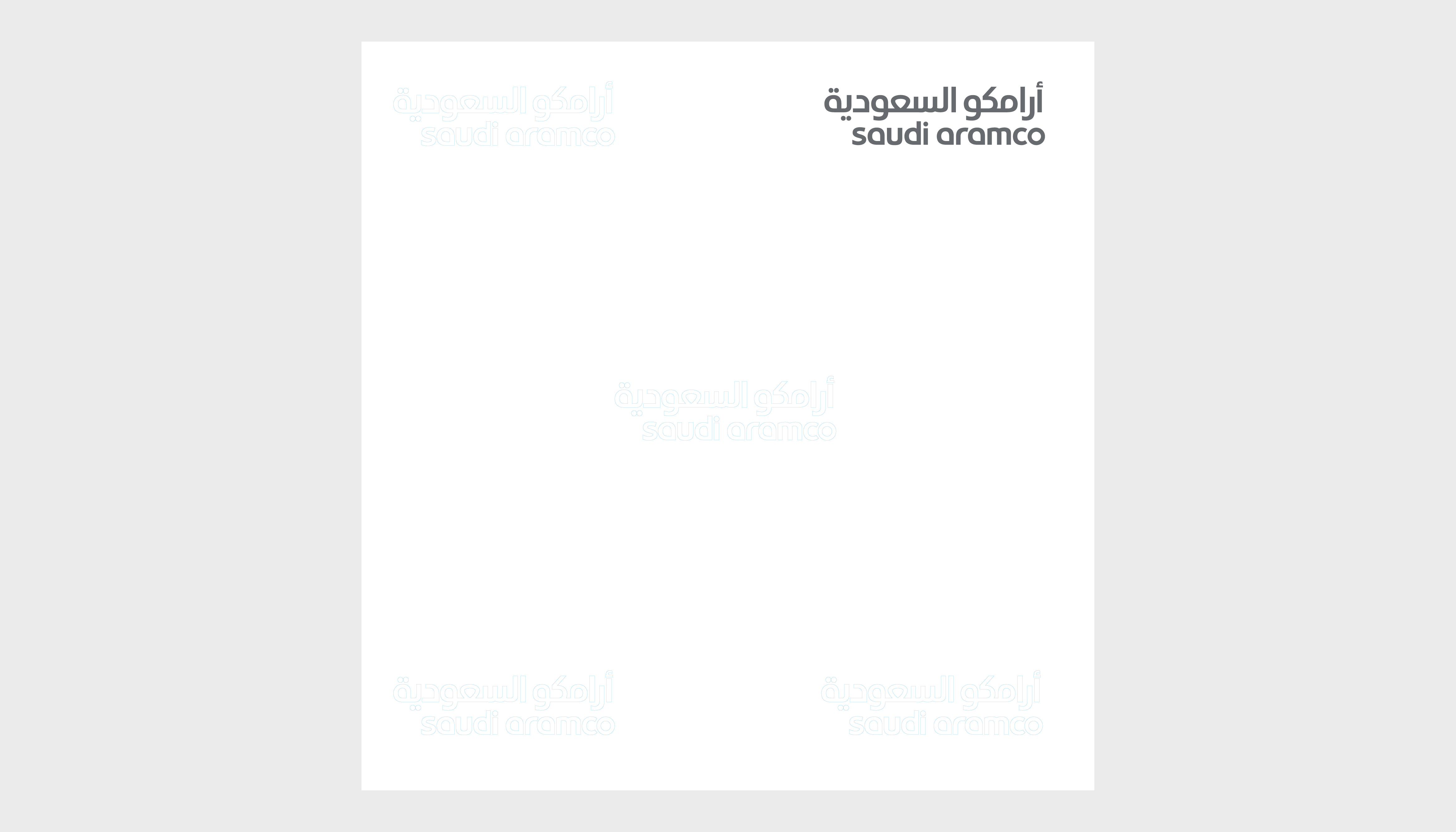
For websites or applications the institutional wordmark should be placed in the most suitable position.
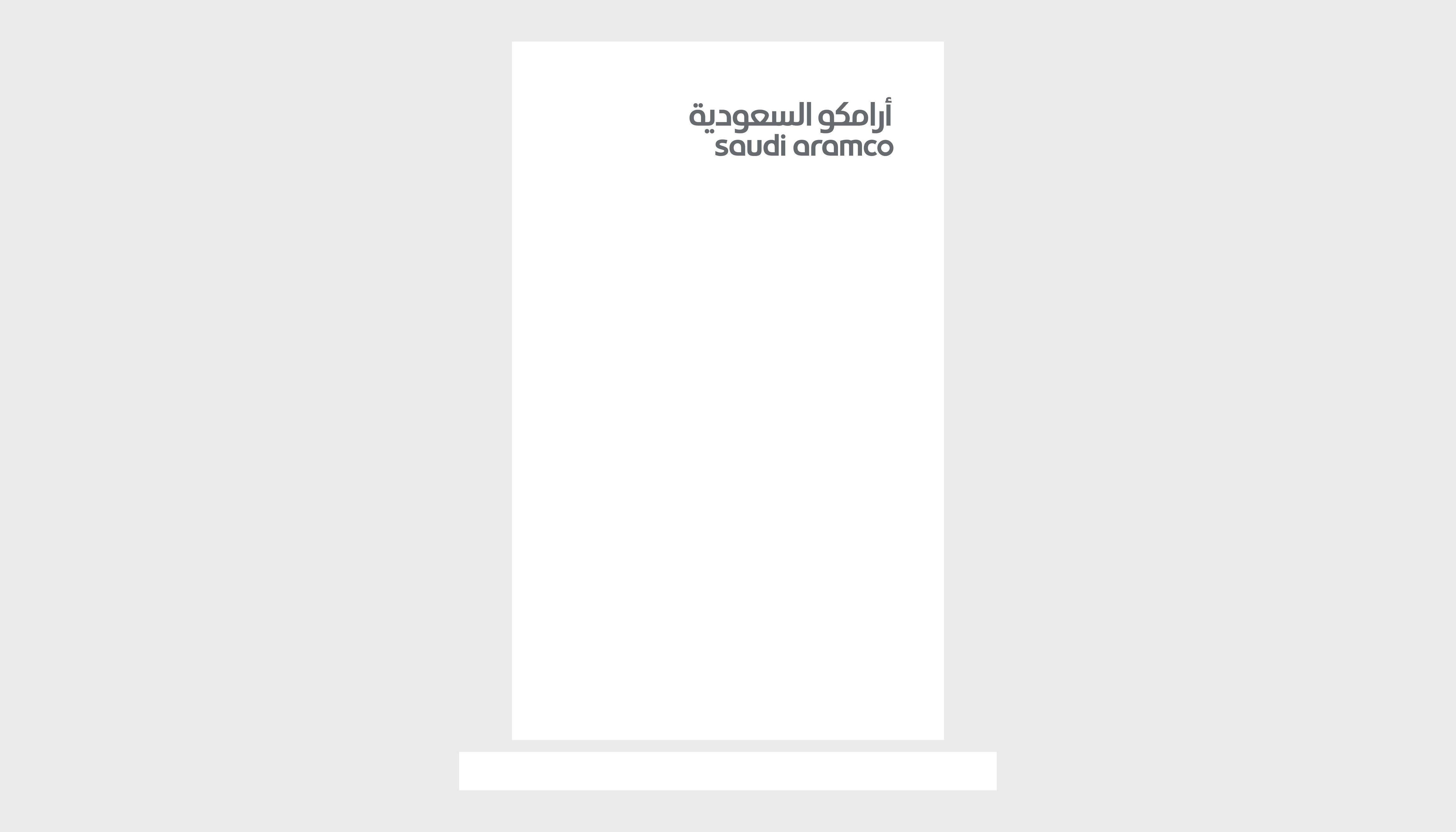
For way signage, the institutional wordmark should be positioned always at the top right.
The institutional visual system should express formality and sophistication.